

Date card
The date card shows the current date in a variety of formats, sizes, and time zones. It pairs well with the Clock card on dashboards used as a daily overview or wall-mounted display.
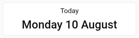 Screenshot of the date card
All options for this card can be configured via the user interface.
Adding the date card to a dashboard
- In the top right of the screen, select the edit
button. - If this is your first time editing a dashboard, the Edit dashboard dialog appears.
- By editing the dashboard, you are taking over control of this dashboard.
- This means that it is no longer automatically updated when new dashboard elements become available.
- Once you’ve taken control, you can’t get this specific dashboard back to update automatically. However, you can create a new default dashboard.
- To continue, in the dialog, select the three dots
menu, then select Take control.
- If this is your first time editing a dashboard, the Edit dashboard dialog appears.
- Add a card and customize actions and features to your dashboard.
Card settings
Configuration Variables
Adjusts the size of the text, allowing a wider range of use with different types of dashboards. Defaults to small.
Selects and orders the parts of the date that are shown. If left empty, the card shows the weekday, day, and month, for example Monday 10 August. See Formatting the date for the available parts.
Formatting the date
Use date_format to choose which parts of the date are shown, and in what order. Add one or more of the following parts:
- Weekday:
-
weekday-short: Short weekday name, for example Mon. -
weekday-long: Full weekday name, for example Monday.
-
- Day:
-
day-numeric: Day of the month, for example 5. -
day-2-digit: Day of the month with a leading zero, for example 05.
-
- Month:
-
month-short: Short month name, for example Aug. -
month-long: Full month name, for example August. -
month-numeric: Month number, for example 8. -
month-2-digit: Month number with a leading zero, for example 08.
-
- Year:
-
year-2-digit: Last two digits of the year, for example 26. -
year-numeric: Full year, for example 2026.
-
- Separator:
-
separator-dash: Adds a dash (-) between parts. -
separator-slash: Adds a slash (/) between parts. -
separator-dot: Adds a dot (.) between parts. -
separator-new-line: Starts a new line.
-
The parts are shown in the order you add them. A space is automatically added between two parts that aren’t separators, so you only need to add a separator when you want different punctuation, such as a slash-separated date.
Examples
Basic example:
type: date
 Screenshot of the basic date card
A larger date card with a title, for a tablet or wall-mounted dashboard:
type: date
title: Today
date_size: large
Screenshot of a large date card with a title
A date card formatted as day/month/year:
type: date
date_format:
  - day-2-digit
  - separator-slash
  - month-2-digit
  - separator-slash
  - year-numeric
 Screenshot of a date card showing a day/month/year formatted date
A date card without a background, showing a different time zone:
type: date
title: Tokyo
time_zone: Asia/Tokyo
no_background: true
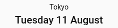 Screenshot of a date card without a background, showing the date in Tokyo