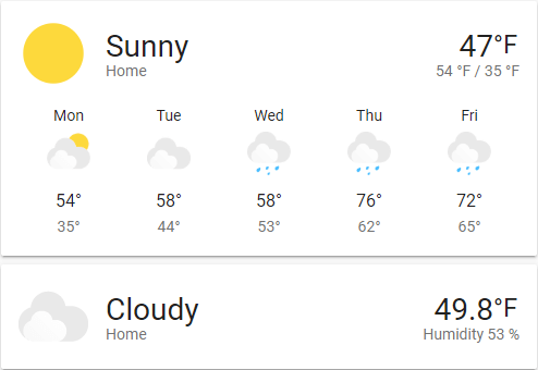
Weather forecast card
The weather forecast card displays the weather. This card is particularly useful on wall-mounted displays.
 Screenshot of the weather card.
Adding the weather forecast card to a dashboard
- In the top right of the screen, select the edit
button. - If this is your first time editing a dashboard, the Edit dashboard dialog appears.
- By editing the dashboard, you are taking over control of this dashboard.
- This means that it is no longer automatically updated when new dashboard elements become available.
- Once you’ve taken control, you can’t get this specific dashboard back to update automatically. However, you can create a new default dashboard.
- To continue, in the dialog, select the three dots
menu, then select Take control.
- If this is your first time editing a dashboard, the Edit dashboard dialog appears.
- Add a card and customize actions and features to your dashboard.
Card settings
The name of the location where the weather platform is located. If not set, the name will be the name set on the weather entity
Here you can specify a secondary attribute to show under the current temperature. Ex. Extrema, Precipitation, Humidity. If not set, it will default to Extrema (High/Low) if available, if not available then Precipitation and if precipitation isn’t available then Humidity.
Check this if you would like to round all temperature values in the card to its nearest integer.
Name of any loaded theme to be used for this card. For more information about themes, see the frontend documentation.
This card works only with platforms that define a weather entity.
E.g., it works with OpenWeatherMap but not OpenWeatherMap Sensor
YAML configuration
The following YAML options are available when you use YAML mode or just prefer to use YAML in the code editor in the UI.
Configuration Variables
Overwrites friendly name. Can be a string, or a name configuration object. See naming documentation.
Show the current weather conditions above the forecast.
Which attribute to display under the temperature.
Defaults to extrema if available, if not available then precipitation and if precipitation isn’t available then humidity.
Round temperature values to the closest integer.
Override the used theme for this card with any loaded theme. For more information about themes, see the frontend documentation.
The action taken on card tap. For more information, see the action documentation.
The action taken on card tap and hold. For more information, see the action documentation.
The action taken on card double-tap. For more information, see the action documentation.
Example
show_current: true
show_forecast: true
type: weather-forecast
entity: weather.openweathermap
forecast_type: daily
Advanced
Themeable icons
The default weather icons are themable via a theme. Theme variables include:
--weather-icon-cloud-front-color
--weather-icon-cloud-back-color
--weather-icon-sun-color
--weather-icon-rain-color
--weather-icon-moon-color
Example theme configuration:
--weather-icon-cloud-front-color: white
--weather-icon-cloud-back-color: blue
--weather-icon-sun-color: orange
--weather-icon-rain-color: purple
Personal icons
Weather icons can be overwritten with your own personal images via a theme. Theme variables include:
--weather-icon-clear-night
--weather-icon-cloudy
--weather-icon-fog
--weather-icon-lightning
--weather-icon-lightning-rainy
--weather-icon-partlycloudy
--weather-icon-pouring
--weather-icon-rainy
--weather-icon-hail
--weather-icon-snowy
--weather-icon-snowy-rainy
--weather-icon-sunny
--weather-icon-windy
--weather-icon-windy-variant
--weather-icon-exceptional

// If your state is not above, use this format
--weather-icon-<state>
Example theme configuration:
--weather-icon-sunny: url("/local/sunny.png")