Gauge card
The gauge card is a basic card that allows visually seeing sensor data.
 Screenshot of the gauge card.
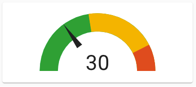 Screenshot of the gauge card in needle mode.
All options for this card can be configured via the user interface.
Adding the gauge card to a dashboard
- In the top right of the screen, select the edit
button. - If this is your first time editing a dashboard, the Edit dashboard dialog appears.
- By editing the dashboard, you are taking over control of this dashboard.
- This means that it is no longer automatically updated when new dashboard elements become available.
- Once you’ve taken control, you can’t get this specific dashboard back to update automatically. However, you can create a new default dashboard.
- To continue, in the dialog, select the three dots
menu, then select Take control.
- If this is your first time editing a dashboard, the Edit dashboard dialog appears.
- Add a card and customize actions and features to your dashboard.
YAML configuration
The following YAML options are available when you use YAML mode or just prefer to use YAML in the code editor in the UI.
Configuration Variables
Overwrites friendly name. Can be a string, or a name configuration object. See naming documentation.
Unit of measurement given to data.
Unit of measurement given by entity
Override the used theme for this card with any loaded theme. For more information about themes, see the frontend documentation.
Show the gauge as a needle gauge. Required to be set to true, if using segments.
Allows setting of colors for different numbers.
List of colors and their corresponding start values. Segments will override the severity settings. Needle required to be true.
Action taken on card tap. See action documentation.
Action taken on card tap and hold. See action documentation.
Action taken on card double tap. See action documentation.
Examples
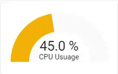
Title and unit of measurement:
type: gauge
name: CPU Usage
unit: '%'
entity: sensor.cpu_usage
Screenshot of the gauge card with custom title and unit of measurement.
Define the severity map:
type: gauge
name: With Severity
unit: '%'
entity: sensor.cpu_usage
severity:
  green: 0
  yellow: 45
  red: 85
Multiple segments:
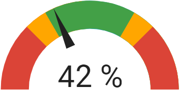 Screenshot of the gauge card with multiple colored segments.
type: gauge
entity: sensor.kitchen_humidity
needle: true
min: 20
max: 80
segments:
  - from: 0
    color: '#db4437'
  - from: 35
    color: '#ffa600'
  - from: 40
    color: '#43a047'
  - from: 60
    color: '#ffa600'
  - from: 65
    color: '#db4437'
CSS variables can be used (instead of CSS ‘#rrggbb’) for default gauge segment colors:
-
var(--success-color)for green color -
var(--warning-color)for yellow color -
var(--error-color)for red color -
var(--info-color)for blue color
Therefore, the previous example can be defined also as:
type: gauge
entity: sensor.kitchen_humidity
needle: true
min: 20
max: 80
segments:
  - from: 0
    color: var(--error-color)
  - from: 35
    color: var(--warning-color)
  - from: 40
    color: var(--success-color)
  - from: 60
    color: var(--warning-color)
  - from: 65
    color: var(--error-color)
Display attribute of an entity instead of its state:
type: gauge
entity: sensor.back_door_info
attribute: battery_level
unit: '%'
max: 100
In this example, the card displays the battery_level attribute of the sensor.back_door_info entity.