Dashboard cards
Each dashboard is made up of cards. Cards display information and let you control your devices. You can arrange them freely across views, resize them in the Sections view layout, and configure actions, features, and conditional visibility.
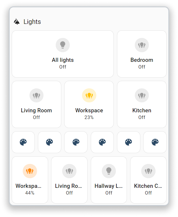
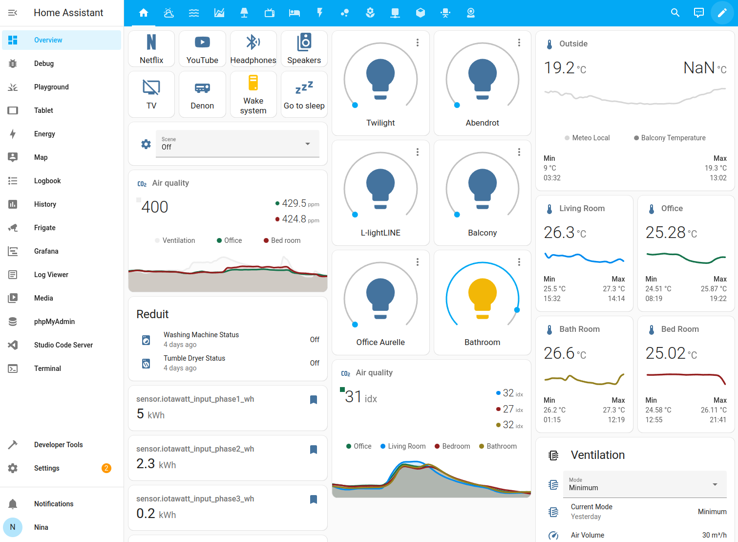 Screenshot of the masonry view with different types of cards.
Card categories
There are several different card types, each with their own configuration options. They can be categorized in terms of their function:
- Specific to a device type or service: alarm, light, humidifier, thermostat, plant status, media control, weather forecast, to-do list, shopping list, map, activity, calendar
- Grouping other cards: vertical stack, horizontal stack, grid
- Logic function: conditional, entity filter
- Display generic data: sensor, history graph, statistic, statistics graph, energy, gauge, clock, Markdown, webpage
- Control devices and entities: button, entity, shortcut
- Display data and control entities: tile, heading, entities, glance, area, picture, picture entity, picture elements, picture glance
Adding cards to your dashboard
A card can be added to a dashboard directly from the view where you want to add it, or from the device page.
To add a card from a view
-
Depending on your dashboard view layout:
- For Sections layout, select
in the section (bottom left). 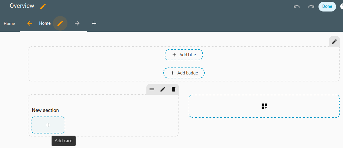
- For other layout types (such as Masonry, Panel, or Sidebar), in the bottom right of the view, select Add card.
- For Sections layout, select
-
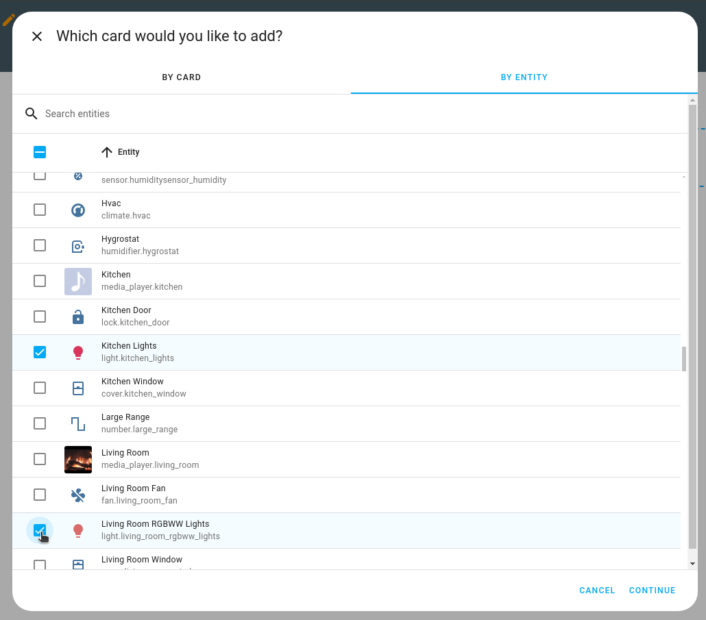
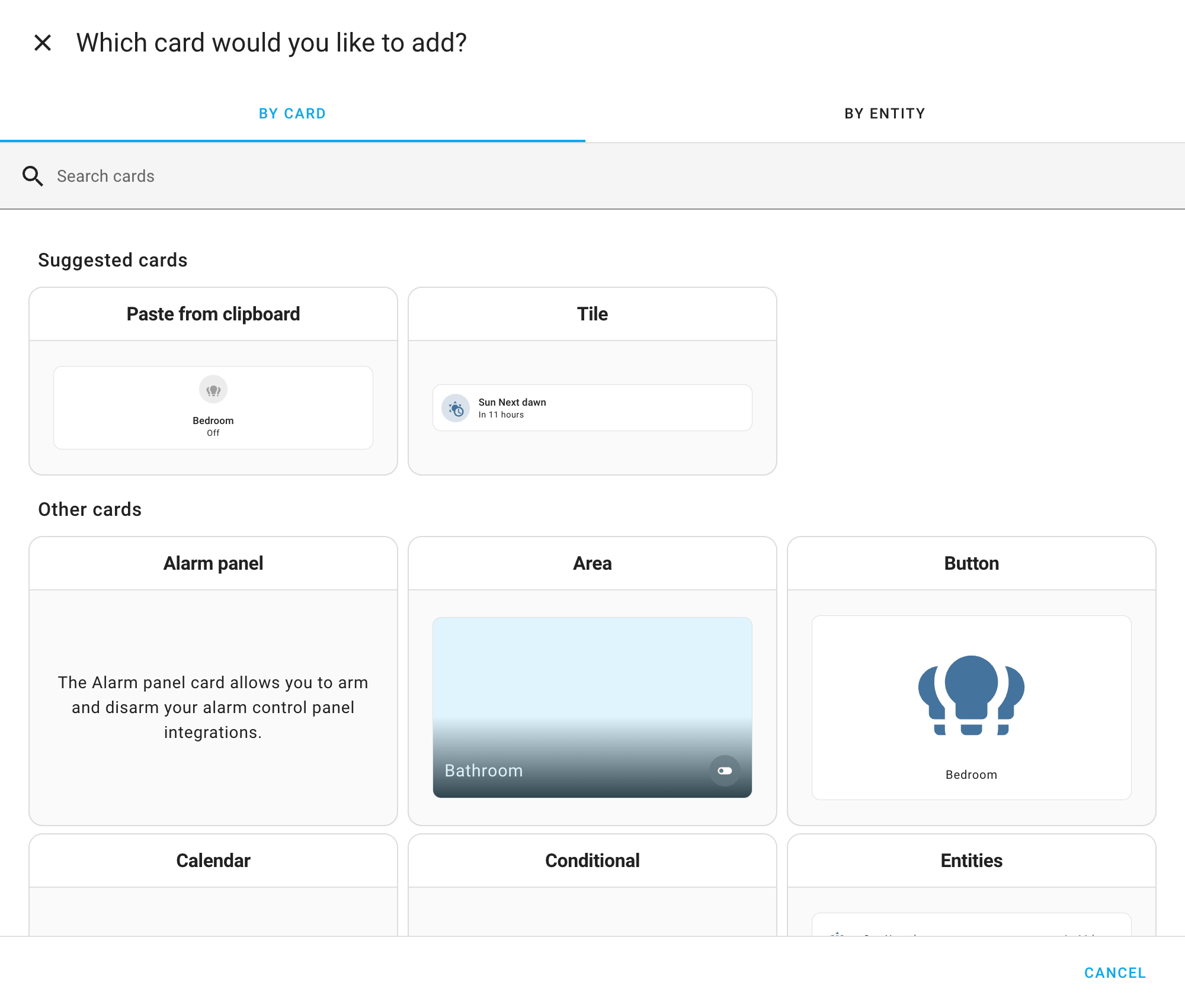
There are two methods to add a card:
-
By entity.
- Select the entities from the list.
- Then, select the card you want from the preview.
- If you can’t see your entity, check the Unassigned section. Entities that are not assigend to an area are listed there.
-
By card:
- Browse the list of available cards.
- If you are using the Sections view, try the Tile card in the Suggested cards section.
-
-
If you want this card to be visible only to specific users or under a certain condition, you can define those conditions.
-
If you are adding this card to a sections view, on the Layout tab, you can resize the card.
-
Customize your card:
- define card actions.
- define header and footer
- customize features.
- Not all cards support these elements. Refer to the documentation of the specific card type.
-
Select Add to dashboard.
To add a card from the device page
This method is useful if you are on the Device page and want to create a card directly from there.
-
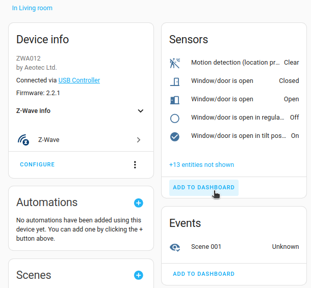
On the integration card of interest, select Devices.
- If there are multiple devices, select the device from the list.
-
Add the card:
- Find the area of interest, for example Sensors, or Events and select Add to Dashboard.
- Find the area of interest, for example Sensors, or Events and select Add to Dashboard.
-
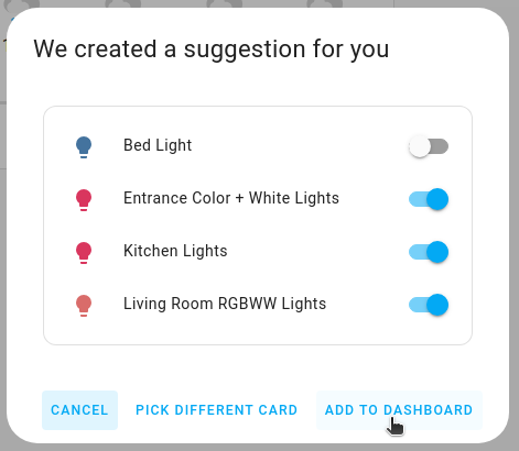
In the dialog, select the target dashboard and if you have multiple views, select the view.
- Select Next.
- If you like the card proposal, select Add to dashboard.
- If you want to change the card, Pick different card and choose your card type.
-
Result: The card is added to the selected view.

-
To edit the card configuration, open the view to which you added the card.
- Select Edit card.
-
If you want this card to be visible only to specific users or under a certain condition, you can define those conditions.
-
If you are adding this card to a sections view, on the Layout tab, you can resize the card.
-
Customize your card:
- define card actions or header and footer widgets.
- define header and footer
- customize features.
- Not all cards support these elements. Refer to the documentation of the specific card type.
Showing or hiding a card or badge conditionally
You can choose to show or hide certain cards or badges based on different conditions. The available conditions are the same as the ones for the conditional card.
- On the Visibility tab, select Add condition.
- Troubleshooting: Don’t see a Visibility tab?
- It is not available inside nested cards: vertical stack, horizontal stack, and grid card
- Troubleshooting: Don’t see a Visibility tab?
- Select the type of condition, and enter the parameters.
- The available conditions are the same as the ones for the conditional card.
- If you define multiple conditions, the card or badge is only shown when all conditions are met.
- If you did not define any conditions, the card or badge is always shown to all users.
- Select Save.
Resizing a card
In sections view, you can resize cards. Follow these steps:
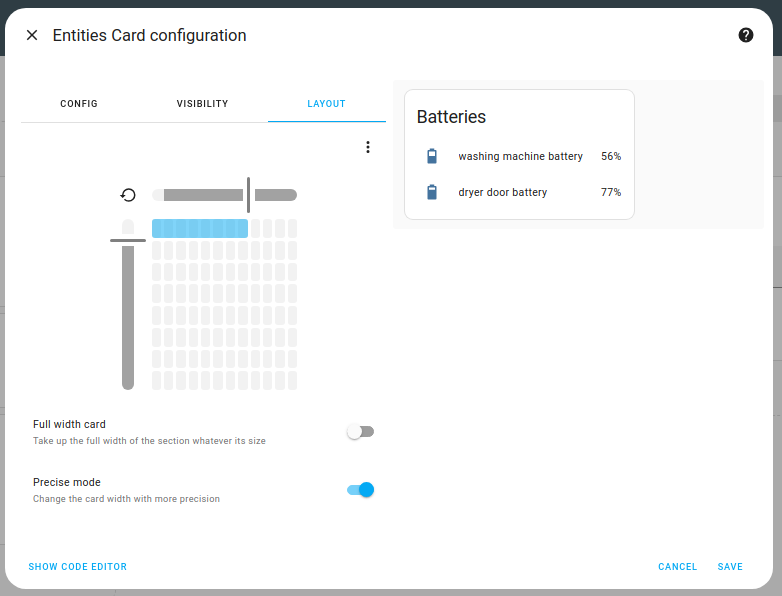
- On the Layout tab, use the grid size picker to adjust the number of columns and rows the card occupies.
- Troubleshooting: Don’t see a Layout tab?
- It is not available inside nested cards: vertical stack, horizontal stack, and grid card
- It is not available on the picture elements card.
- Troubleshooting: Don’t see a Layout tab?
- To make the card span the full width of the section, regardless of section size, enable Full width card.
- If you want a finer grid to size your card, enable Precise mode. The last row was done using precise mode.
- Select Save.
Revert resizing of a card
If you previously resized a card in the sections view, and you don’t like the new size, you can revert back to the card’s default size. Follow these steps:
-
On the Layout tab, select the
icon. -
Select Save.
Card actions, features, header and footer widgets
Some cards have support for tap actions. These actions define what will happen when you tap or hold on an object within a card.
Some cards have support for features. These widgets add quick controls to the card. Supported features depend on the card and entity capabilities. Multiple features can be added to a single card.
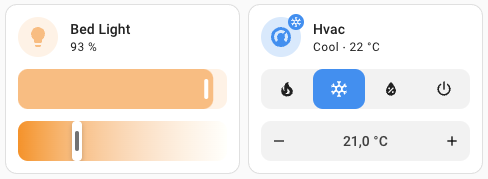 Screenshot of tile cards with features.
Some cards have support for header and footer widgets. These widgets fill up the entire available space in a card.
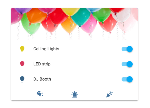 Screenshot of an entities card with a picture header and buttons footer.