Button card
The button card allows you to add buttons to perform tasks.
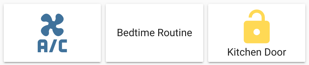 Screenshot of three button cards.
All options for this card can be configured via the user interface.
Adding the button card to a dashboard
- In the top right of the screen, select the edit
button. - If this is your first time editing a dashboard, the Edit dashboard dialog appears.
- By editing the dashboard, you are taking over control of this dashboard.
- This means that it is no longer automatically updated when new dashboard elements become available.
- Once you’ve taken control, you can’t get this specific dashboard back to update automatically. However, you can create a new default dashboard.
- To continue, in the dialog, select the three dots
menu, then select Take control.
- If this is your first time editing a dashboard, the Edit dashboard dialog appears.
- Add a card and customize actions and features to your dashboard.
Card settings
The button name that is displayed on the card. If this field is left blank and the card interacts with an entity, the button name defaults to the entity name. Otherwise, no name is displayed.
The icon that is displayed on the card. If this field is left blank and the card interacts with an entity, the icon defaults to the entity domain icon. Otherwise, no icon is displayed.
Name of any loaded theme to be used for this card. For more information about themes, see the frontend documentation.
The action taken on card tap. For more information, see the action documentation.
The action taken on card tap and hold. For more information, see the action documentation.
YAML configuration
The following YAML options are available when you use YAML mode or just prefer to use YAML in the code editor in the UI.
Configuration Variables
Overwrites friendly name. Can be a string, or a name configuration object. See naming documentation. It defaults to the entity name only if the card interacts with an entity. Otherwise, if not configured, no name is displayed.
The icon that is displayed on the card. It defaults to the entity domain icon only if the card interacts with an entity. Otherwise, if not configured, no icon is displayed.
Set the color for the icon. By default, the color is based on state, domain, and device_class of your entity. It accepts color token or hex color code.
The action taken on card tap. For more information, see the action documentation.
The action taken on card tap and hold. For more information, see the action documentation.
The action taken on card double-tap. For more information, see the action documentation.
Override the used theme for this card with any loaded theme. For more information about themes, see the frontend documentation.
Examples
Basic example:
type: button
entity: light.living_room
Button card with a button name and a script that runs when card is tapped:
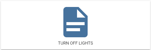 Screenshot of the button card with script action.
type: button
name: Turn Off Lights
show_state: false
tap_action:
  action: perform-action
  perform_action: script.turn_on
  data:
    entity_id: script.turn_off_lights
Example of 4 buttons on a vertical stack card:
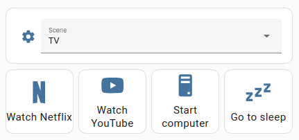 Screenshot of a vertical stack card with 4 buttons and an entity selector.
The image shows a vertical stack card with 4 buttons arranged in a horizontal stack card and an entity selector. The buttons use the toggle action to run a script, for example, the Netflix script, which starts up the TV and opens Netflix. To learn how to create scripts, refer to scripts.
type: vertical-stack
cards:
  - entities:
      - entity: input_select.living_room_scene
        name: Scene
    show_header_toggle: false
    type: entities
  - type: horizontal-stack
    cards:
      - name: Watch Netflix
        entity: script.netflix
        type: button
        tap_action:
          action: toggle
        hold_action:
          action: more-info
        show_name: true
        show_icon: true
      - name: Watch YouTube
        entity: script.youtube
        type: button
        tap_action:
          action: toggle
        hold_action:
          action: more-info
        show_name: true
        show_icon: true
      - name: Wake PC
        entity: script.wake_on_lan
        type: button
        tap_action:
          action: toggle
        icon: mdi:desktop-tower
        show_name: true
        show_icon: true
        show_state: false
      - name: Go to sleep
        entity: script.sleep
        type: button
        tap_action:
          action: toggle
        icon: mdi:sleep
        hold_action:
          action: more-info
        show_name: true
        show_icon: true
Available colors
The following colors are available to colorize the button card: primary, accent, disabled, red, pink, purple, deep-purple, indigo, blue, light-blue, cyan, teal, green, light-green, lime, yellow, amber, orange, deep-orange, brown, grey, blue-grey, black, white, or any hex color code (for example, #93c47d).