Calendar card
The calendar card displays your calendarA calendar entity represents a schedule of events coming from a local or external calendar source. It can be used to trigger automations based on the start or end of an event, react to offsets (like 15 minutes before), or retrieve event details through services. [Learn more] entitiesAn entity represents a sensor, actor, or function in Home Assistant. Entities are used to monitor physical properties or to control other entities. An entity is usually part of a device or a service. [Learn more] in a month, day, and list view (7 days).
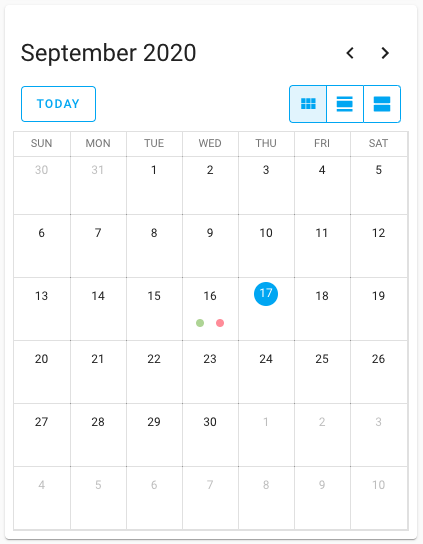 Screenshot of the calendar card.
All options for this card can be configured via the user interface.
Adding the calendar card to a dashboard
- In the top right of the screen, select the edit
button. - If this is your first time editing a dashboard, the Edit dashboard dialog appears.
- By editing the dashboard, you are taking over control of this dashboard.
- This means that it is no longer automatically updated when new dashboard elements become available.
- Once you’ve taken control, you can’t get this specific dashboard back to update automatically. However, you can create a new default dashboard.
- To continue, in the dialog, select the three dots
menu, then select Take control.
- If this is your first time editing a dashboard, the Edit dashboard dialog appears.
- Add a card and customize actions and features to your dashboard.
YAML configuration
The following YAML options are available when you use YAML mode or just prefer to use YAML in the code editor in the UI.
Configuration Variables
The view that will show first when the card is loaded onto the page. Options are dayGridMonth, dayGridDay, and listWeek. Note that listWeek does show the next 7 days, not a calendar week.
Override the used theme for this card with any loaded theme. For more information about themes, see the frontend documentation.
Examples
type: calendar
entities:
  - calendar.calendar_1
  - calendar.calendar_2