

Alert card
The alert card highlights an entityAn entity represents a sensor, actor, or function in Home Assistant. Entities are used to monitor physical properties or to control other entities. An entity is usually part of a device or a service. [Learn more] that needs attention, such as a door left open, a leak, or a triggered alarm. It looks like a tile card with a colored background that can pulse to draw the eye. Below the name, it shows the state, when it last changed, and the entity’s area, unless you hide the state. By default, selecting the card opens the More info dialog. This card supports actions.
The card supports alarm control panel, binary sensor, cover, and lock entities. Its color and pulse only show while the entity is in an alert state:
- Alarm control panel: triggered
- Binary sensor: on
- Cover: open
- Lock: jammed, unlocked, or open
The rest of the time, the card uses the clear color, if you set one, and doesn’t pulse. To hide the card when nothing needs attention, add a visibility condition on the entity’s state.
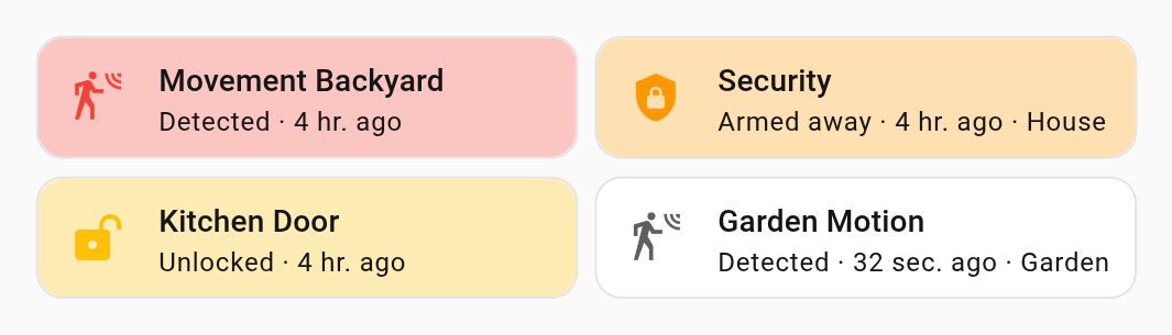 Alert cards with red, orange, amber, and no color.
Adding the alert card to a dashboard
- In the top right of the screen, select the edit
button. - If this is your first time editing a dashboard, the Edit dashboard dialog appears.
- By editing the dashboard, you are taking over control of this dashboard.
- This means that it is no longer automatically updated when new dashboard elements become available.
- Once you’ve taken control, you can’t get this specific dashboard back to update automatically. However, you can create a new default dashboard.
- To continue, in the dialog, select the three dots
menu, then select Take control.
- If this is your first time editing a dashboard, the Edit dashboard dialog appears.
- Add a card and customize actions and features to your dashboard.
Card settings
The entity to show. Only alarm control panel, binary sensor, cover, and lock entities are supported.
The clear color while the entity isn’t in an alert state, the alert color while it is (the state color by default), and whether the background pulses during an alert. Colors accept a color token or a hex color code. With no color, the background isn’t colored and the icon is gray. When reduced motion is turned on in your system settings, a pulsing background stays tinted instead.
The name, icon, and layout, and whether to hide the state. These options work the same as on the tile card.
The actions to perform when you select the card. See card actions.
YAML configuration
The following YAML options are available when you use YAML mode or prefer to use YAML in the code editor in the UI.
Configuration Variables
Overwrites friendly name. Can be a string, or a name configuration object. See naming documentation.
The color of the icon and background when the entity isn’t in an alert state. Accepts state, a color token, or hex color code. Set to none for no color.
The color of the icon and background while the entity is in an alert state. Accepts the same values as clear_color.
Animates the colored background while the entity is in an alert state.
Action taken on card tap. See action documentation. By default, it will show the “more-info” dialog.
Action taken on tap-and-hold. See action documentation.
Action taken on double tap. See action documentation.
Examples
A red alert for a leak, using the default color:
type: alert
entity: binary_sensor.kitchen_leak
A pulsing alert for the front door, which is green while the door is closed:
type: alert
entity: binary_sensor.front_door
clear_color: green
alert_color: deep-orange
pulse: true
A pulsing alert, shown only while the front door is open:
type: alert
entity: binary_sensor.front_door
alert_color: deep-orange
pulse: true
visibility:
  - condition: state
    entity: binary_sensor.front_door
    state: "on"
A vertical alert for the alarm, with its own name:
type: alert
entity: alarm_control_panel.home
name: Alarm
vertical: true