Entities card
The entities card is the most common type of card. It groups items together into lists. It can be used to display an entity’s state or attribute, but also contain buttons, web links, and more.
Adding the entities card to a dashboard
- In the top right of the screen, select the edit
button. - If this is your first time editing a dashboard, the Edit dashboard dialog appears.
- By editing the dashboard, you are taking over control of this dashboard.
- This means that it is no longer automatically updated when new dashboard elements become available.
- Once you’ve taken control, you can’t get this specific dashboard back to update automatically. However, you can create a new default dashboard.
- To continue, in the dialog, select the three dots
menu, then select Take control.
- If this is your first time editing a dashboard, the Edit dashboard dialog appears.
- Add a card and customize actions and features to your dashboard.
YAML configuration
The following YAML options are available when you use YAML mode or just prefer to use YAML in the code editor in the UI.
Configuration Variables
Override the used theme for this card with any loaded theme. For more information about themes, see the frontend documentation.
Set to true to have icons colored when entity is active.
Header widget to render. See header documentation.
Footer widget to render. See footer documentation.
Options for entities
If you define entities as objects instead of strings (by adding entity: before entity ID), you can add more customization and configuration.
Configuration Variables
Sets a custom card type: custom:my-custom-card. It also can be used to force entities with a default special row format to render as a simple state. You can do this by setting the type: simple-entity. This can be used, for example, to replace a helper with an editable control with a read-only value.
Overwrites friendly name. Can be a string, or a name configuration object. See naming documentation.
Show additional info. Values: entity-id, last-changed, last-updated, area, last-triggered (only for automations and scripts), position or tilt-position (only for supported covers), brightness (only for lights).
How the state should be formatted. Currently only used for timestamp sensors. Valid values are: relative, total, date, time and datetime.
Set to true to have icons colored when entity is active.
Action taken on row tap. See action documentation.
Action taken on row tap and hold. See action documentation.
Action taken on row double tap. See action documentation.
For entities that display a button element in the row (for example, button, lock, script), this option adds a confirmation dialog to the press of the button. See options for confirmation for configuration options.
Special row elements
Rather than only displaying an entity’s state as a text output, the entities card supports multiple special rows for buttons, attributes, web links, dividers, sections, and more.
Attribute
Configuration Variables
Overwrites friendly name. Can be a string, or a name configuration object. See naming documentation.
Button
Row with an (optional) icon, label and a single text button at the end of the row that can trigger a defined action.
Configuration Variables
Row label. Either entity or name (or both) needs to be provided.
Friendly name of entity if specified.
Action taken on button tap. See action documentation.
Action taken on button tap and hold. See action documentation.
Action taken on button double tap. See action documentation.
Buttons
Multiple buttons displayed in a single row next to each other. See examples further below.
Configuration Variables
A list of entities to show. Each entry is either an entity ID or a map.
Overwrites friendly name. Can be a string, or a name configuration object. See naming documentation.
Action taken on button tap. See action documentation.
Action taken on button tap and hold. See action documentation.
Action taken on button double tap. See action documentation.
Cast
Special row to start Home Assistant Cast.
Conditional
Special row that displays based on entity states.
Configuration Variables
List of conditions to check. See available conditions.
Divider
Section
Weblink
Configuration Variables
Open link in new tab. If link is external URL or a download link, this will automatically be true. Use if internal URL should be opened in new tab.
Examples
Entity rows
type: entities
title: Entities card sample
show_header_toggle: true
header:
  image: "https://www.home-assistant.io/images/dashboards/header-footer/balloons-header.png"
  type: picture
entities:
  - entity: alarm_control_panel.alarm
    name: Alarm Panel
  - device_tracker.demo_paulus
  - switch.decorative_lights
  - group.all_lights
  - group.all_locks
Buttons row
Above the divider are regular entity rows, below one of type buttons. Note that regular entity rows automatically show the entity name, whereas for buttons you have to explicitly specify a label / name.
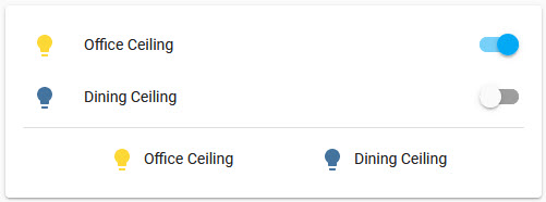 Screenshot of buttons row.
type: entities
entities:
  - entity: light.office_ceiling
  - entity: light.dining_ceiling
  - type: divider
  - type: buttons
    entities:
      - entity: light.office_ceiling
        name: Office Ceiling
      - entity: light.dining_ceiling
        name: Dining Ceiling
Other special rows
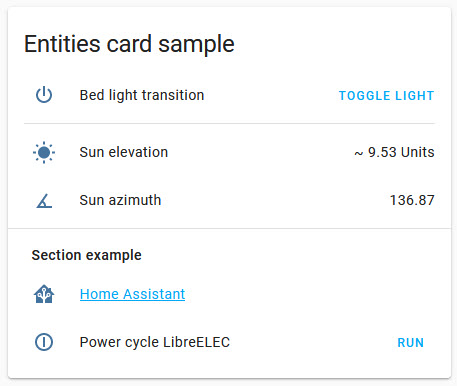 Screenshot of other special rows.
type: entities
title: Entities card sample
entities:
  - type: button
    icon: mdi:power
    name: Bed light transition
    action_name: Toggle light
    tap_action:
      action: perform-action
      perform_action: light.toggle
      data:
        entity_id: light.bed_light
        transition: 10
  - type: divider
  - type: attribute
    entity: sun.sun
    attribute: elevation
    name: Sun elevation
    prefix: "~"
    suffix: Units
  - type: conditional
    conditions:
      - entity: sun.sun
        state: above_horizon
    row:
      entity: sun.sun
      type: attribute
      attribute: azimuth
      icon: mdi:angle-acute
      name: Sun azimuth
  - type: section
    label: Section example
  - type: weblink
    name: Home Assistant
    url: https://www.home-assistant.io/
    icon: mdi:home-assistant
  - type: button
    name: Power cycle LibreELEC
    icon: mdi:power-cycle
    tap_action:
      action: perform-action
      confirmation:
        text: Are you sure you want to restart?
      perform_action: script.libreelec_power_cycle