Picture glance card
The picture glance card shows an image and lets you place small icons of entity states on top of that card to control those entities from there. In the image below: the entities on the right allow toggle actions, the others show the more information dialog.
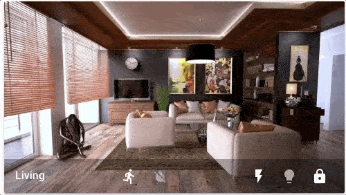 Picture glance card for a living room.
Adding a picture glance card to your dashboard
-
To add a card, follow steps 1-4 on adding a card from a view.
- In step 2, on the By card tab, select picture glance card.
-
Add a picture:
- Upload picture lets you pick an image from the system used to show your Home Assistant UI.
-
Local path lets you pick an image stored on Home Assistant. For example:
/homeassistant/images/lights_view_background_image.jpg.- To store an image on Home Assistant, you need to configure access to files, for example via Samba or the Studio Code Server app (formerly known as add-on).
-
web URL let you use an image from the web. For example
https://www.home-assistant.io/images/frontpage/assist_wake_word.png.
-
Define the parameters that are specific to the picture glance card.
- For a description of the specific settings, refer to the description under YAML configuration.
- They also apply to the UI.
-
Save your changes.
YAML configuration
The following YAML options are available when you use YAML mode or just prefer to use YAML in the code editor in the UI.
Configuration Variables
Background image based on entity state.
Forces the height of the image to be a ratio of the width. Valid formats: Height percentage value (23%) or ratio expressed with colon or “x” separator (16:9 or 16x9). For a ratio, the second element can be omitted and will default to “1” (1.78 equals 1.78:1).
Defines the manner in which the image is stretched/clipped to fit the card area. cover: The image keeps its aspect ratio and fills the given dimension. The image will be clipped to fit. contain: The image keeps its aspect ratio, but is resized to fit within the given dimension. fill: The image is resized to fill the given dimension. If necessary, the image will be stretched or squished to fit.
Override the used theme for this card with any loaded theme. For more information about themes, see the frontend documentation.
Action taken on card tap. See action documentation.
Action taken on card tap and hold. See action documentation.
Action taken on card double tap. See action documentation.
Options for entities
If you define entities as objects instead of strings, you can add more customization and configuration:
Configuration Variables
Action taken on card tap. See action documentation.
Action taken on card tap and hold. See action documentation.
Action taken on card double tap. See action documentation.
How to use state_filter
Specify different CSS filters
state_filter:
  "on": brightness(110%) saturate(1.2)
  "off": brightness(50%) hue-rotate(45deg)
entity: switch.decorative_lights
Examples
This section lists a few examples of how the picture glance card can be used.
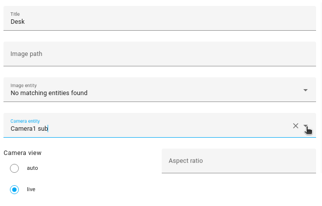
Creating a card to control the camera
If your camera supports PTZ (can be moved in different directions), you can use the picture glance card to control the camera.
 Picture glance card to control the camera.
-
Select your camera entity.
-
Image path and Image entity are not required.
-
Image path and Image entity are not required.
-
If you want something to happen when you tap the card itself, define a tap action.
- Here, we toggle a light.
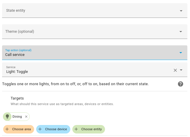
- Here, we toggle a light.
-
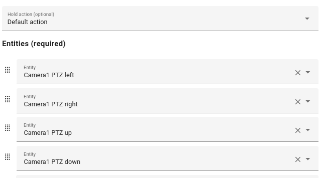
Select the entities to move the camera left, right, up, or down.
-
Select Show code editor.
-
For each of the entities, specify an icon, as indicated in the YAML example.
-
For the buttons to react on press (instead of bringing up the dialog):
- For each of the entities, under
tap_action, use abutton.pressaction.
camera_view: live type: picture-glance title: Desk entities: - entity: button.camera1_ptz_left icon: mdi:pan-left tap_action: action: perform-action perform_action: button.press data: entity_id: button.camera1_ptz_left - entity: button.camera1_ptz_right icon: mdi:pan-right tap_action: action: perform-action perform_action: button.press data: entity_id: button.camera1_ptz_right - entity: button.camera1_ptz_up icon: mdi:pan-up tap_action: action: perform-action perform_action: button.press data: entity_id: button.camera1_ptz_up - entity: button.camera1_ptz_down icon: mdi:pan-down tap_action: action: perform-action perform_action: button.press data: entity_id: button.camera1_ptz_down camera_image: camera.camera1_sub tap_action: action: perform-action perform_action: light.toggle target: entity_id: light.philips_929003052501_01_huelight - For each of the entities, under
-
That’s it. You can now control your camera from the picture glance card on your dashboard.
More examples
type: picture-glance
title: Living room
entities:
  - switch.decorative_lights
  - light.ceiling_lights
  - lock.front_door
  - binary_sensor.movement_backyard
  - binary_sensor.basement_floor_wet
image: /local/living_room.png
Display a camera image as background:
type: picture-glance
title: Living room
entities:
  - switch.decorative_lights
  - light.ceiling_lights
camera_image: camera.demo_camera
Display a camera image without additional entities:
type: picture-glance
title: Front garden
entities: []
camera_image: camera.front_garden_camera
Use different images based on entity state (supports local, web, or media-source:// URLs):
type: picture-glance
title: Living room
entities:
  - switch.decorative_lights
  - light.ceiling_lights
state_image:
  "on": /local/living_room_on.png
  "off": https://demo.home-assistant.io/stub_config/living_room.png
  "unavailable": media-source://image_upload/123456789
entity: group.living.room