Markdown card
The Markdown card is used to render Markdown.
 Screenshot of the Markdown card.
The renderer uses Marked.js, which supports several specifications of Markdown, including CommonMark, GitHub Flavored Markdown (GFM) and markdown.pl. JavaScript in HTML blocks is not supported.
To add the markdown card to your user interface:
- In the top right of the screen, select the edit
button. - If this is your first time editing a dashboard, the Edit dashboard dialog appears.
- By editing the dashboard, you are taking over control of this dashboard.
- This means that it is no longer automatically updated when new dashboard elements become available.
- Once you’ve taken control, you can’t get this specific dashboard back to update automatically. However, you can create a new default dashboard.
- To continue, in the dialog, select the three dots
menu, then select Take control.
- If this is your first time editing a dashboard, the Edit dashboard dialog appears.
- Add a card and customize actions and features to your dashboard.
YAML configuration
The following YAML options are available when you use YAML mode or just prefer to use YAML in the code editor in the UI.
Configuration Variables
The algorithm for placing cards aesthetically may have problems with the Markdown card if it contains templates. You can use this value to help it estimate the height of the card in units of 50 pixels (approximately 3 lines of text in default size). (e.g., 4)
A list of entity IDs so a template in content: only reacts to the state changes of these entities. This can be used if the automatic analysis fails to find all relevant entities.
Override the used theme for this card with any loaded theme. For more information about themes, see the frontend documentation.
By default, an empty card will still be shown (resulting in a small empty box). Setting this to false hides that empty card instead.
Example
type: markdown
content: >
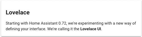
## Dashboards
Starting with Home Assistant 0.72, we're experimenting with a new way of defining your interface.
Template variables
A special template variable - config is set up for the content of the card. It contains the configuration of the card.
For example:
type: entity-filter
entities:
  - light.bed_light
  - light.ceiling_lights
  - light.kitchen_lights
state_filter:
  - 'on'
card:
  type: markdown
  content: |
    The lights that are on are:
    {% for l in config.entities %}
      - {{ l.entity }}
    {%- endfor %}

    And the door is {% if is_state('binary_sensor.door', 'on') %} open {% else %} closed {% endif %}.
A special template variable - user is set up for the content of the card. It contains the currently logged in user.
For example:
type: markdown
content: |
  Hello, {{user}}
Icons
You can use Material Design Icons icons in the content of the card.
For example:
type: markdown
content: |
  <ha-icon icon="mdi:home-assistant"></ha-icon>
ha-alert
You can also use our ha-alert component in the Markdown card.
Example:
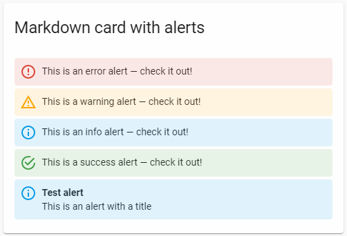 Screenshot of the ha-alert elements in a markdown card.
type: markdown
content: |
  <ha-alert alert-type="error">This is an error alert — check it out!</ha-alert>
  <ha-alert alert-type="warning">This is a warning alert — check it out!</ha-alert>
  <ha-alert alert-type="info">This is an info alert — check it out!</ha-alert>
  <ha-alert alert-type="success">This is a success alert — check it out!</ha-alert>
  <ha-alert title="Test alert">This is an alert with a title</ha-alert>
ha-qr-code
You can also create QR-Codes in the Markdown card.
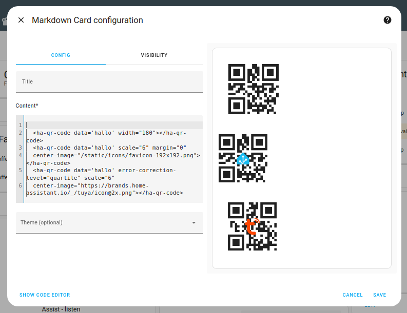 Screenshot of the Markdown card with QR codes.
Available parameters:
- data: The actual data to encode in the QR-Code
- scale: A scale factor for the QR code, default is 4
- width: Width of the QR code in pixels
- margin: A margin around the QR code
- error-correction-level: low; medium; quartile; high
- center-image: An image to place on top of the qr code (might need a higher error-correction-level)
type: markdown
content: >-
  <ha-qr-code data='hallo' width="180"></ha-qr-code>

  <ha-qr-code data='hallo' scale="6" margin="0"
  center-image="/static/icons/favicon-192x192.png"></ha-qr-code>

  <ha-qr-code data='hallo' error-correction-level="quartile" scale="6"
  center-image="https://brands.home-assistant.io/_/tuya/[email protected]"></ha-qr-code>
Presentation Tables
HTML tables with role="presentation" receive special styling optimized for layout purposes rather than data display. These tables are useful for creating structured layouts with icons, status information, and formatted content.
Default Styling
Tables marked with role="presentation" have:
- No borders by default
- No padding by default
- Middle vertical alignment for cells
Example: Status Card Here’s an example creating a status notification with an icon and multi-line text:
  <table role="presentation">
    <tr>
      <td rowspan="3" width="70">
        <img src="/local/icons/alert.png" width="48" height="48"/>
      </td>
      <td><strong>System Status Alert</strong></td>
    </tr>
    <tr>
      <td>Priority: High - Requires attention</td>
    </tr>
    <tr>
      <td>Active since: 2024-01-22 14:30</td>
    </tr>
  </table>