Glance card
The glance card is useful to group multiple sensors in a compact overview. Keep in mind that this can be used together with entity-filter cards to create dynamic cards.
 Screenshot of the glance card.
To add the glance card to your user interface:
- In the top right of the screen, select the edit
button. - If this is your first time editing a dashboard, the Edit dashboard dialog appears.
- By editing the dashboard, you are taking over control of this dashboard.
- This means that it is no longer automatically updated when new dashboard elements become available.
- Once you’ve taken control, you can’t get this specific dashboard back to update automatically. However, you can create a new default dashboard.
- To continue, in the dialog, select the three dots
menu, then select Take control.
- If this is your first time editing a dashboard, the Edit dashboard dialog appears.
- Add a card and customize actions and features to your dashboard.
All options for this card can be configured via the user interface.
YAML configuration
The following YAML options are available when you use YAML mode or just prefer to use YAML in the code editor in the UI.
Configuration Variables
Override the used theme for this card with any loaded theme. For more information about themes, see the frontend documentation.
Number of columns to show. If not specified the number will be set automatically.
Options for entities
If you define entities as objects instead of strings, you can add more customization and configuration:
Configuration Variables
Overwrites friendly name. Can be a string, or a name configuration object. See naming documentation.
Overwrites the state display with the relative time since last changed.
Action taken on card tap. See action documentation.
Action taken on card tap and hold. See action documentation.
Action taken on card double tap. See action documentation.
Examples
Basic example:
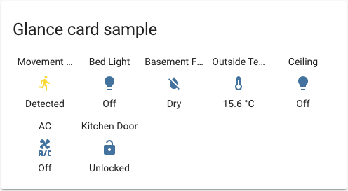
type: glance
title: Glance card sample
entities:
  - binary_sensor.movement_backyard
  - light.bed_light
  - binary_sensor.basement_floor_wet
  - sensor.outside_temperature
  - light.ceiling_lights
  - switch.ac
  - lock.kitchen_door
Screenshot of the glance card with custom title.
Define entities as objects and apply a custom name:
type: glance
title: Better names
entities:
  - entity: binary_sensor.movement_backyard
    name: Movement?
  - light.bed_light
  - binary_sensor.basement_floor_wet
  - sensor.outside_temperature
  - light.ceiling_lights
  - switch.ac
  - lock.kitchen_door
  - entity: switch.wall_plug_switch
    tap_action:
      action: toggle