Views
A view is a tab inside a dashboard. For example, the screenshot below shows a separate view for lights on the Overview dashboard.
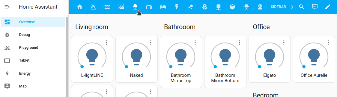 A lights view tab on the Overview dashboard
Views control the layout.
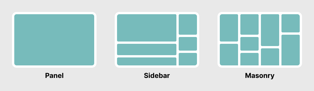 The three basic view layouts: panel, sidebar, and masonry
There are four different view types:
- Sections (default): Arranges cards in a grid system and lets you group them in sections.
- Masonry: Arranges cards in columns based on their card size.
- Panel: Displays one card in full width. For example a map or an image.
- Sidebar: Arranges cards in 2 columns, a wide one and a smaller one on the right.
Adding a view to a dashboard
-
To add a view to your dashboard, in the top right corner, select the pencil icon.
-
Select the
+button in the top menu bar.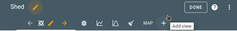
-
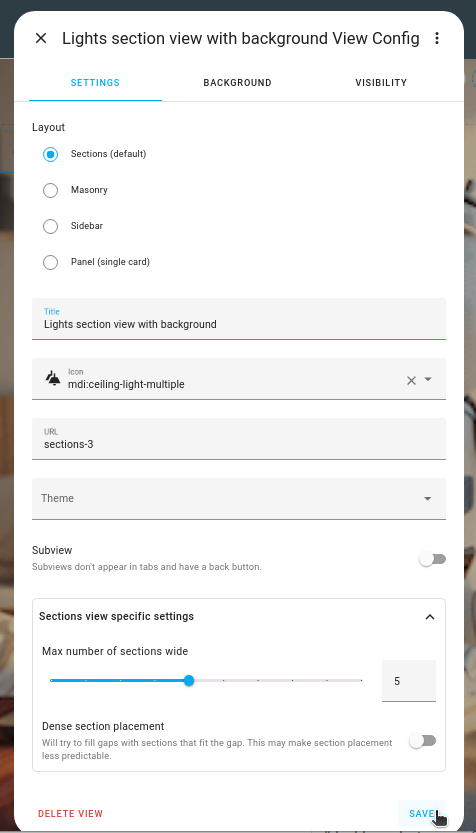
Define the view settings:
- If you want a view title, enter the Title.
- If you want to see an icon, select the view icon.
- If an icon is defined, only the icon is shown. The text title is shown as a tooltip. To show both the icon and the text title, enable the Show icon and title toggle.
- We use Material icons.
- If you want to link to another view, define the URL.
- If you want to use a previously defined theme, select the theme.
- Select the view type.
- If this view is meant to be used as a subview only, enable the Subview toggle.
- If you are using Sections view, choose the number of columns you want to use, and, if you want to let the system fill gaps between cards, enable Dense section placement..
-
To use a background image, on the Background tab, select an image and customize the background settings. Read more about these options.
-
On the Badges tab, select the entities you want to be represented by a badge.
- Sidebar and panel views do not support badges.
-
By default, the new section is visible to all users. On the Visibility tab, you can disable the view for users.
Migrating a view into a sections view
If you have already defined a view but you would now like to have it in a section view type, you can migrate that content. For example, you can migrate from a masonry to a sections view. Currently, you cannot migrate a sections view type into another view type.
Migrating does not affect the current view. It will stay as is, and a new, additional view is created.
To migrate a view into a sections view type, follow these steps:
-
Open the view you want to migrate, and go into edit mode.
-
In the configuration dialog, select the new view type.
-
If the new view type offers additional settings, define those settings.
- For more information on those settings, refer to the documentation of that view type.
-
In the top-right corner, select Convert.
- Result: A new, additional view is created.
- Your current view will stay untouched.
- A new tab opens, and all your cards are imported to the new view.
-
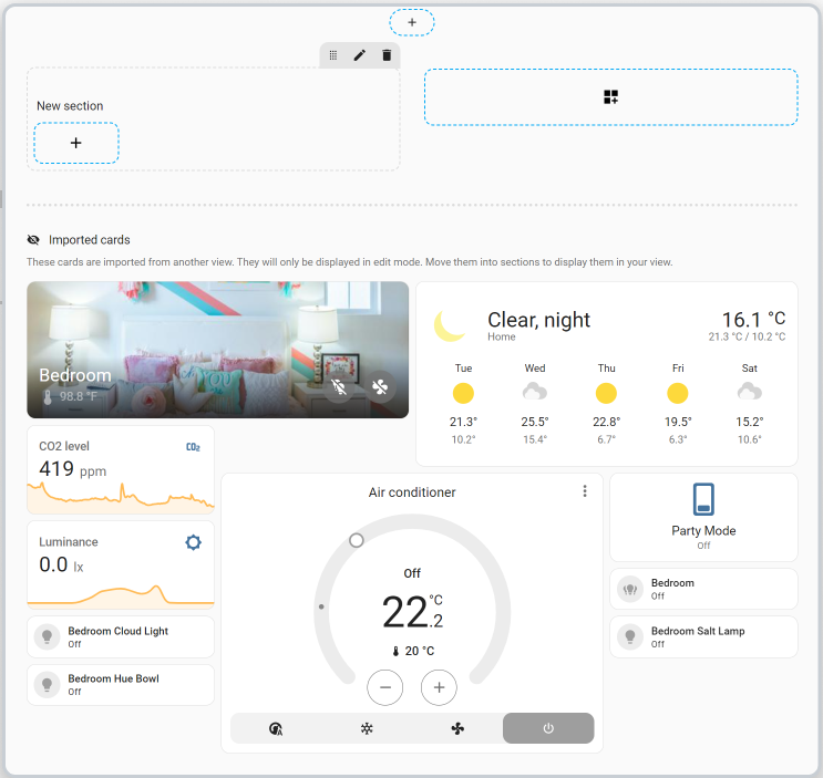
In the Imported cards section, pick each of the cards, and drag them into the sections.
- To edit and customize the view, follow the steps in the sections view documentation.
-
To save your changes, select Done.
- Result: Your new dashboard is shown.
- If you have cards that were not yet integrated, you can still add them later. They are still available in the Edit mode, in the Imported cards section.
URL of a view
You can link to one view from a card in another view when using cards that support navigation (navigation_path). The string supplied here will be appended to the string /lovelace/ to create the path to the view. Do not use special characters in paths. Do not begin a path with a number. This will cause the parser to read your path as a view index.
Example
View configuration:
- title: Living room
  # the final path is /lovelace/living_room
  path: living_room
Picture card configuration:
- type: picture
  image: /local/living_room.png
  tap_action:
    action: navigate
    navigation_path: /lovelace/living_room
View icon
If a view icon is defined, only the icon is shown. The text title is shown as a tooltip. To show both the icon and the text title, enable the Show icon and title toggle.
Examples
- title: Garden
  icon: mdi:flower
- title: Garden
  icon: mdi:flower
  show_icon_and_title: true
Visible
You can specify the visibility of views as a whole or per-user. (Note: This is only for the display of the tabs. The URL path is still accessible)
Example
views:
  - title: Ian
    visible:
      - user: 581fca7fdc014b8b894519cc531f9a04
    cards:
      ...
  - title: Chelsea
    visible:
      - user: 6e690cc4e40242d2ab14cf38f1882ee6
    cards:
      ...
  - title: Admin
    visible: db34e025e5c84b70968f6530823b117f
    cards:
      ...
Options for visible objects
If you define visible as objects instead of a boolean to specify conditions for displaying the view tab:
Changing the view type in YAML
You can change the layout of a view in YAML by using a different view type. The default is section.
Example
- title: Map
  type: panel
  cards:
    - type: map
      entities:
        - device_tracker.demo_paulus
        - zone.home
Theme
Set a separate theme for the view and its cards.
Example
- title: Home
  theme: happy
Background
The background settings of a view can be customized to display a background. Alternatively, a theme variable can be used to customize the background of all views.
View-specific background settings
Image - Sets the background image to use behind the view:
- Upload picture lets you pick an image from the system used to show your Home Assistant UI.
-
Local path lets you pick an image stored on Home Assistant. For example:
/homeassistant/images/lights_view_background_image.jpg.- To store an image on Home Assistant, you need to configure access to files, for example via Samba or the Studio Code Server app.
-
web URL let you pick an image from the web. For example
https://www.home-assistant.io/images/frontpage/assist_wake_word.png.
Configuration Variables
Customize the view’s background with options for image, transparency, size, alignment, repeat, and attachment.
Adjust the background’s opacity, from fully opaque to transparent.
Choose how the background fits the space. Defaults to the original picture size, fill view (cover in YAML) fills the view with cropping if necessary and fits view (contain in YAML) fits the image within the view, maintaining aspect ratio.
Precisely position the background. Valid options can be anything between top left and bottom right, with center being the default.
Controls whether the background repeats across the view. Repeating is useful when a tiled background is being used.
Example
# Example background section in view yaml
background:
  image: /local/background.png
  opacity: 50 # any percentage between 0 and 100
  size: auto # auto, cover, contain
  alignment: center # top left, top center, top right, center left, center, center right, bottom left, bottom center, bottom right
  repeat: no-repeat # repeat, no-repeat
  attachment: scroll # scroll, fixed
Background theme variable
You can style the background of all your views with a theme. You can use the CSS variable lovelace-background. For wallpapers you probably want to use the example below, more options can be found here.
Example
# Example configuration.yaml entry
frontend:
  themes:
    example:
      lovelace-background: center / cover no-repeat url("/local/background.png") fixed
Subview
A “View” can be marked as “Subview”. Subviews won’t show up in the navigation bar on top of the sidebar. Subviews can, for instance, be used to show detailed information; you could link to this subview from a page with a clean look with only basic information (by using cards that support the navigate action). Think of a view with a few thermostats and a subview with status information on the heating/cooling device.
When on the subview, the navigation bar only shows the name of the subview and a back button (no icon is shown).
By default, clicking on back button will navigate to the previous view but a custom back path (back_path) can be set.
You can access subviews from other parts of your dashboard by using cards that support the navigate action.
Example
Simple subview:
- title: Map
  subview: true
Subview with custom back path:
- title: Map
  subview: true
  back_path: /lovelace/home
Configuration Variables
A list of view configurations.
List of entities IDs or badge objects to display as badges. Note that badges do not show when view is in panel mode.
Icon-name from Material Design Icons. You can use any icon from Material Design Icons. Prefix the icon name with mdi:, ie mdi:home. Only for “View”, not for “Subview”.
Show both icon and text title. Only for “View”, not for “Subview”.
Hide/show the view tab from all users or a list of individual visible objects.
Example
View configuration:
- title: Living room
  badges:
    - device_tracker.demo_paulus
    - entity: light.ceiling_lights
      name: Ceiling Lights
      icon: mdi:bulb
    - entity: switch.decorative_lights
      image: /local/lights.png
Subview configuration:
- title: "Energieprijzen"
  path: "energieprijzen"
  subview: true
  back_path: "/ui-data/climate"

  cards:
    - type: entities
      entities:
        - sensor.today_avg_price