Picture elements card
The picture elements card is one of the most versatile types of cards.
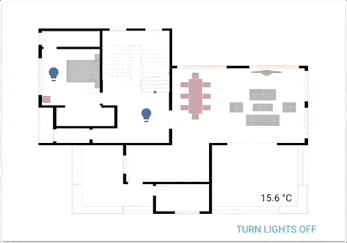 A functional floorplan powered by picture elements.
The cards allow you to position icons or text and even buttons on an image based on coordinates. Imagine floor plan, imagine picture-glance with no restrictions!
To add the picture elements card to your user interface:
- In the top right of the screen, select the edit
button. - If this is your first time editing a dashboard, the Edit dashboard dialog appears.
- By editing the dashboard, you are taking over control of this dashboard.
- This means that it is no longer automatically updated when new dashboard elements become available.
- Once you’ve taken control, you can’t get this specific dashboard back to update automatically. However, you can create a new default dashboard.
- To continue, in the dialog, select the three dots
menu, then select Take control.
- If this is your first time editing a dashboard, the Edit dashboard dialog appears.
- Add a card and customize actions and features to your dashboard.
YAML configuration
The following YAML options are available when you use YAML mode or just prefer to use YAML in the code editor in the UI.
Configuration Variables
The URL of an image.
To use a locally hosted image, see Hosting, or use a media-source:// URL for Media content.
Override the used theme for this card with any loaded theme. For more information about themes, see the frontend documentation.
This image is used when the dark mode is activated and no state image is set.
To use a locally hosted image, see Hosting, or use a media-source:// URL for Media content.
Elements
Elements are the active components (icons, badges, buttons, text, etc.) that overlay the image.
There are several different element types that can be added to a Picture Elements card:
State badge
This element creates a badge representing the state of an entity.
Configuration Variables
Position and style the element using CSS.
position: absolute, transform: translate(-50%, -50%)
An optional alternative name displayed below the state badge. Defaults to the entity name if not provided. Set to null to hide.
State badge tooltip. Defaults to the entity name if not provided. Set to null to hide.
Action taken on card tap. See action documentation.
Action taken on card tap and hold. See action documentation.
Action taken on card double tap. See action documentation.
State icon
This element represents an entity state using an icon.
Configuration Variables
Set to true to have icons colored when entity is active.
Action taken on card tap. See action documentation.
Action taken on card tap and hold. See action documentation.
Action taken on card double tap. See action documentation.
Position and style the element using CSS.
position: absolute, transform: translate(-50%, -50%)
State label
This element represents an entity’s state via text.
Configuration Variables
If present, the corresponding attribute will be shown, instead of the entity’s state.
Action taken on card tap. See action documentation.
Action taken on card tap and hold. See action documentation.
Action taken on card double tap. See action documentation.
Position and style the element using CSS.
position: absolute, transform: translate(-50%, -50%)
Perform action button
This entity creates a button (with arbitrary text) that can be used to perform an action.
Configuration Variables
Position and style the element using CSS.
position: absolute, transform: translate(-50%, -50%)
Icon element
This element creates a static icon that is not linked to the state of an entity.
Configuration Variables
Action taken on card tap. See action documentation.
Action taken on card tap and hold. See action documentation.
Action taken on card double tap. See action documentation.
Position and style the element using CSS.
position: absolute, transform: translate(-50%, -50%)
Image element
This creates an image element that overlays the background image.
Configuration Variables
Entity to use for state_image and state_filter and also target for actions.
Action taken on card tap. See action documentation.
Action taken on card tap and hold. See action documentation.
Action taken on card double tap. See action documentation.
The image to display.
To use a locally hosted image, see Hosting, or use a media-source:// URL for Media content.
Default: grayscale(100%) when entity state is off. Set to none to remove this.
Forces the height of the image to be a ratio of the width. Valid formats: Height percentage value (23%) or ratio expressed with colon or “x” separator (16:9 or 16x9). For a ratio, the second element can be omitted and will default to “1” (1.78 equals 1.78:1).
Position and style the element using CSS.
position: absolute, transform: translate(-50%, -50%)
Conditional element
Much like the Conditional card, this element will let you show its sub-elements based on entity states.
Configuration Variables
List of entity IDs and matching states.
One or more elements of any of the listed types to show when conditions are met. See below for an example.
Custom elements
The process for creating and referencing custom elements is the same as for custom cards. Please see the developer documentation for more information.
Configuration Variables
Position and style the element using CSS.
position: absolute, transform: translate(-50%, -50%)
Notes on element attributes
How to use the style object
Position and style your elements using CSS. More/other keys are also possible.
Note, the default style for most elements includes translate(-50%, -50%), which means that the coordinates you provide will set the position of the center of the element. Use transform: none to disable this behavior.
style:
  # Positioning of the element
  left: 50%
  top: 50%
How to use state_image
Specify a different image to display based on the state of the entity (supports local, web, or media-source:// URLs):
state_image:
  "on": /local/bed_light_on.png
  "off": https://demo.home-assistant.io/stub_config/bedroom.png
  "unavailable": media-source://image_upload/123456789
How to use state_filter
Specify different CSS filters
state_filter:
  "on": brightness(110%) saturate(1.2)
  "off": brightness(50%) hue-rotate(45deg)
How to use click-and-hold
If the option hold_action is specified, that action will be performed when the entity is clicked and held for half a second or more.
tap_action:
  action: toggle
hold_action:
  action: perform-action
  perform_action: light.turn_on
  data:
    entity_id: light.bed_light
    brightness_pct: 100
Examples
Example of icons, labels and buttons
type: picture-elements
image: /local/floorplan.png
elements:
  - type: state-icon
    tap_action:
      action: toggle
    entity: light.ceiling_lights
    style:
      top: 47%
      left: 42%
  - type: state-icon
    tap_action:
      action: toggle
    entity: light.kitchen_lights
    style:
      top: 30%
      left: 15%
  - type: state-label
    entity: sensor.outside_temperature
    style:
      top: 82%
      left: 79%
  - type: state-label
    entity: climate.kitchen
    attribute: current_temperature
    suffix: "°C"
    style:
      top: 33%
      left: 15%
  - type: action-button
    title: Turn lights off
    style:
      top: 95%
      left: 60%
    action: homeassistant.turn_off
    target:
      entity_id: group.all_lights
  - type: icon
    icon: mdi:home
    tap_action:
      action: navigate
      navigation_path: /lovelace/0
    style:
      top: 10%
      left: 10%
Images example
type: picture-elements
image: /local/floorplan.png
elements:
  # state_image & state_filter - toggle on click
  - type: image
    entity: light.living_room
    tap_action:
      action: toggle
    image: /local/living_room.png
    state_image:
      "off": /local/living_room_off.png
    filter: saturate(.8)
    state_filter:
      "on": brightness(120%) saturate(1.2)
    style:
      top: 25%
      left: 75%
      width: 15%
  # Camera, red border, rounded-rectangle - show more-info on click
  - type: image
    entity: camera.driveway_camera
    camera_image: camera.driveway_camera
    style:
      top: 5%
      left: 10%
      width: 10%
      border: 2px solid red
      border-radius: 10%
  # Single image, state_filter - perform action on click
  - type: image
    entity: media_player.living_room
    tap_action:
      action: perform-action
      perform_action: media_player.media_play_pause
      target:
        entity_id: media_player.living_room
    image: /local/television.jpg
    filter: brightness(5%)
    state_filter:
      playing: brightness(100%)
    style:
      top: 40%
      left: 75%
      width: 5%
Conditional example
type: picture-elements
image: /local/House.png
elements:
  # conditionally show TV off button shortcut when dad's away and daughter is home
  - type: conditional
    conditions:
      - entity: sensor.presence_daughter
        state: "home"
      - entity: sensor.presence_dad
        state: "not_home"
    elements:
      - type: state-icon
        entity: switch.tv
        tap_action:
          action: toggle
        style:
          top: 47%
          left: 42%