Selectors
Selectors can be used to specify what values are accepted for a blueprint input. The selector also defines how the input is shown in the user interface.
Some selectors can, for example, show a toggle button to turn something on or off, while another select can filter a list of devices to show only devices that have motion-sensing capabilities.
Having good selectors set on your blueprint automation inputs makes a blueprint easier to use from the UI.
The following selectors are currently available:
- Action selector
- App selector
- Area selector
- Attribute selector
- Assist pipeline selector
- Backup location selector
- Boolean selector
- Color temperature selector
- Condition selector
- Config entry selector
- Constant selector
- Conversation agent selector
- Country selector
- Date selector
- Date & time selector
- Device selector
- Duration selector
- Entity selector
- Floor selector
- Icon selector
- Label selector
- Language selector
- Location selector
- Media selector
- Number selector
- Object selector
- QR code selector
- RGB color selector
- Select selector
- State selector
- Statistic selector
- Target selector
- Template selector
- Text selector
- Theme selector
- Time selector
- Trigger selector
Interactive demos of each of these selectors can be found on the Home Assistant Design portal.
If no selector is defined, a text input for a single line will be shown.
Action selector
The action selector allows you to input one or more sequences of actions. On the user interface, the action part of the automation editor will be shown. The value of the input will contain a list of actions to perform.
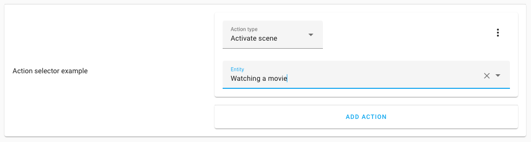
This selector does not have any other options; therefore, it only has its key.
action:
The output of this selector is a list of actions. For example:
# Example action selector output result
- action: scene.turn_on
  target:
    entity_id: scene.watching_movies
  metadata: {}
App selector
This can only be used on a Home Assistant Operating SystemHome Assistant OS, the Home Assistant Operating System, is an embedded, minimalistic, operating system designed to run the Home Assistant ecosystem on single board computers (like the Raspberry Pi) or Virtual Machines. It includes Home Assistant Core, the Home Assistant Supervisor, and supports apps. Home Assistant Supervisor keeps it up to date, removing the need for you to manage an operating system. Home Assistant Operating System is the recommended installation type for most users. installation. For Home Assistant ContainerHome Assistant Container is a standalone container-based installation of Home Assistant Core. Any OCI compatible runtime can be used, but the documentation focus is on Docker. [Learn more] installations, an error will be displayed.
The app selector (formerly known as add-on selector) allows you to input an app slug. On the user interface, it will list all installed Home Assistant apps and use the slug of the selected app.
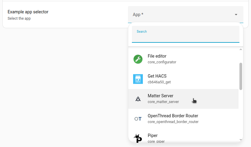
This selector does not have any other options; therefore, it only has its key.
# Example app selector
app:
The output of this selector is the slug of the selected app.
For example: core_ssh.
Area selector
The area selector shows an area finder that can pick a single or multiple areas
based on the selector configuration. The value of the input will be the area ID,
or a list of area IDs, based on if multiple is set to true.
An area selector can filter the list of areas, based on properties of the devices and entities that are assigned to those areas. For example, the areas list could be limited to areas with entities provided by the ZHA integration.
In its most basic form, this selector doesn’t require any options, which will show all areas.

area:
Configuration Variables
When device options are provided, the list of areas is filtered by areas that at least provide one device that matches the given conditions. Can be either an object or a list of objects.
Can be set to an integration domain. Limits the list of areas that provide devices by the set integration domain, for example, zha.
When set, it limits the list of areas that provide devices by the set manufacturer name.
When set, it limits the list of areas that provide devices that have the set model.
When entity options are provided, the list of areas is filtered by areas that at least provide one entity that matches the given conditions. Can be either a object or a list of object.
Can be set to an integration domain. Limits the list of areas that provide entities by the set integration domain, for example, zha.
Limits the list of areas that provide entities of a certain domain(s), for example, light or binary_sensor. Can be either a string with a single domain, or a list of string domains to limit the selection to.
Limits the list of areas to areas that have entities with a certain device class(es), for example, motion or window. Can be either a string with a single device_class, or a list of string device_class to limit the selection to.
Limits the list of areas to areas that have entities with a certain supported feature, for example, light.LightEntityFeature.TRANSITION or climate.ClimateEntityFeature.TARGET_TEMPERATURE. Should be a list of features. For a list of supported features for each entity type, refer to the entity documentation.
The output of this selector is the area ID, or (in case multiple is set to
true) a list of area IDs.
# Example area selector output result, when multiple is set to false
living_room

# Example area selector output result, when multiple is set to true
- living_room
- kitchen
Example area selectors
An example area selector only shows areas that provide one or more lights or switches provided by the ZHA integration.
area:
  entity:
    integration: zha
    domain:
      - light
      - switch
Another example uses the area selector, which only shows areas that provide one or more remote controls provided by the deCONZ integration. Multiple areas can be selected.
area:
  multiple: true
  device:
    - integration: deconz
      manufacturer: IKEA of Sweden
      model: TRADFRI remote control
Attribute selector
The attributes selector shows a list of state attributes from a provided entity of which one can be selected.
This allows for selecting, for example, the “Effect” attribute from a light entity, or the
“Next dawn” attribute from the sun entity.
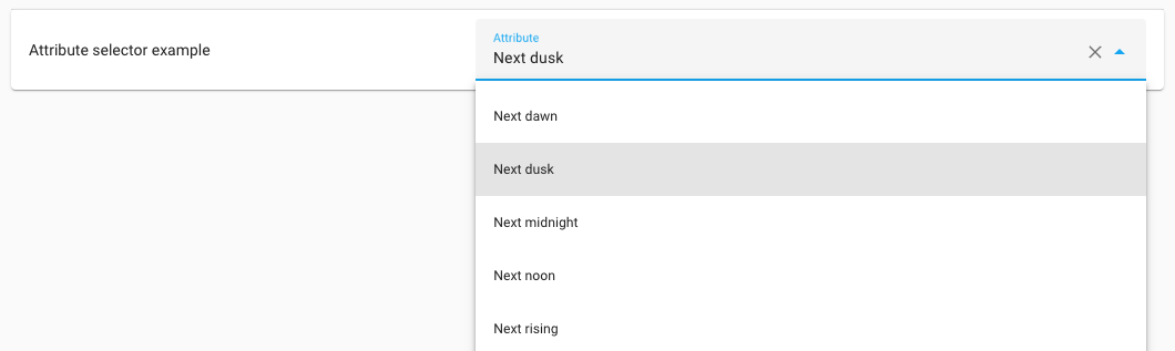
The output of this selector is the selected attribute key (not the translated or
prettified name shown in the frontend).
For example: next_dawn.
Assist pipeline selector
The assist pipeline selector shows all available assist pipelines (assistants) of which one can be selected.
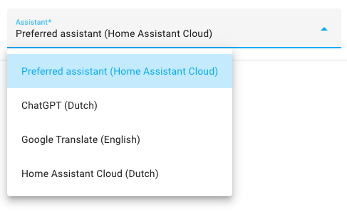
This selector does not have any other options; therefore, it only has its key.
assist_pipeline:
Backup location selector
This can only be used on an installation with a Home Assistant Operating SystemHome Assistant OS, the Home Assistant Operating System, is an embedded, minimalistic, operating system designed to run the Home Assistant ecosystem on single board computers (like the Raspberry Pi) or Virtual Machines. It includes Home Assistant Core, the Home Assistant Supervisor, and supports apps. Home Assistant Supervisor keeps it up to date, removing the need for you to manage an operating system. Home Assistant Operating System is the recommended installation type for most users.. For Home Assistant ContainerHome Assistant Container is a standalone container-based installation of Home Assistant Core. Any OCI compatible runtime can be used, but the documentation focus is on Docker. [Learn more] installations, an error
will be displayed.
The backup location selector shows a list of places a backup could go, depending on what you have configured in storage.
The output of this selector is the name of the selected network storage. It may
also be the value /backup, if the user chooses to use the local data disk option
instead of one of the configured network storage locations.
backup_location:
Boolean selector
The boolean selector shows a toggle that allows you to turn on or off the selected option.
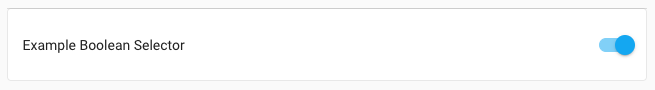
The boolean selector is suitable for adding feature switches to, for example, blueprints.
This selector does not have any other options; therefore, it only has its key.
boolean:
The output of this selector is true when the toggle is on, false otherwise.
Color temperature selector
The color temperature selector allows you to select a color temperature from a gradient using a slider.

color_temp:
Configuration Variables
The chosen unit for the color temperature. This can be either kelvin or mired. mired is the default for historical reasons.
The minimum color temperature in the chosen unit.
2700 for kelvin 153 for mired
The output of this selector is the number representing the chosen color temperature for the unit used.
Condition selector
The condition selector allows you to input one or more conditions. On the user interface, the condition part of the automation editor will be shown. The value of the input will contain a list of conditions.
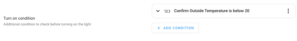
This selector does not have any other options; therefore, it only has its key.
condition:
The output of this selector is a list of conditions. For example:
# Example condition selector output result
- condition: numeric_state
  entity_id: "sensor.outside_temperature"
  below: 20
Config entry selector
The config entry selector allows you to select an integration configuration entry. The selector returns the entry ID of the selected integration configuration entry.
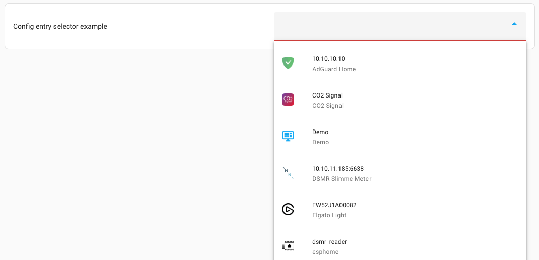
config_entry:
The output of this selector is the entry ID of the config entry, for example, 6b68b250388cbe0d620c92dd3acc93ec.
Constant selector
The constant selector shows a toggle that allows you to enable the selected option. This is similar to the boolean selector, the difference is that the constant selector has no value when it’s not enabled.
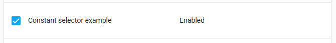
The selector’s value must be configured, and optionally, a label.
constant:
  value: true
  label: Enabled
The output of this selector is the configured value when the toggle is on, it has no output otherwise.
Conversation agent selector
The conversation agent selector allows picking a conversation agent.

The selector has 1 option, language. This filters the conversation agents shown, depending on the language.
conversation_agent:
  language: en
The output of this selector is the ID of the conversation agent.
Country selector
The country selector allows a user to pick a country from a list of countries.

country:
Configuration Variables
A list of countries to pick from, this should be ISO 3166 country codes.
The available countries in the Home Assistant frontend
The output of this selector is an ISO 3166 country code.
Date selector
The date selector shows a date input that allows you to specify a date.
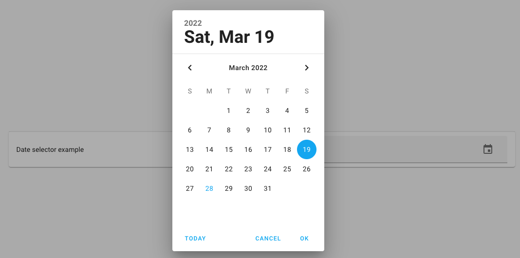
This selector does not have any other options; therefore, it only has its key.
date:
The output of this selector will contain the date in Year-Month-Day
(YYYY-MM-DD) format, for example, 2022-02-22.
Date & time selector
The date selector shows a date and time input that allows you to specify a date with a specific time.

This selector does not have any other options; therefore, it only has its key.
datetime:
The output of this selector will contain the date in Year-Month-Day
(YYYY-MM-DD) format and the time in 24-hour format, for example:
2022-02-22 13:30:00.
Device selector
The device selector shows a device finder that can pick a single or multiple
devices based on the selector configuration. The value of the input will contain
the device ID or a list of device IDs, based on if multiple is set to true.
A device selector can filter the list of devices, based on things like the manufacturer, model, or model ID of the device, the entities the device provides or based on the domain that provided the device.
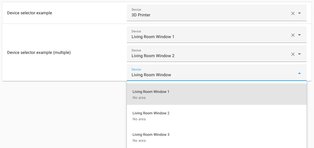
In its most basic form, this selector doesn’t require any options, which will show all devices.
device:
Configuration Variables
When entity options are provided, the list of devices is filtered by devices that at least provide one entity that matches the given conditions. Can be either an object or a list of objects.
Can be set to an integration domain. Limits the list of devices that provide entities by the set integration domain, for example, zha.
Limits the list of devices that provide entities of a certain domain(s), for example, light or binary_sensor. Can be either a string with a single domain, or a list of string domains to limit the selection to.
Limits the list of devices to devices that have entities with a certain device class(es), for example, motion or window. Can be either a string with a single device_class, or a list of string device_class to limit the selection to.
Limits the list of devices to devices that have entities with a certain supported feature, for example, light.LightEntityFeature.TRANSITION or climate.ClimateEntityFeature.TARGET_TEMPERATURE. Should be a list of features. For a list of supported features for each entity type, refer to the entity documentation.
When filter options are provided, the list of devices is filtered by devices that at least provide one entity that matches the given conditions. Can be either an object or a list of objects.
Can be set to an integration domain. Limits the list of devices to devices provided by the set integration domain.
When set, it limits the list of devices to devices provided by the set manufacturer name.
The output of this selector is the device ID, or (in case multiple is set to
true) a list of devices IDs.
# Example device selector output result, when multiple is set to false
faadde5365842003e8ca55267fe9d1f4

# Example device selector output result, when multiple is set to true
- faadde5365842003e8ca55267fe9d1f4
- 3da77cb054352848b9544d40e19de562
Example device selector
An example entity selector that, will only show devices that are:
- Provided by the deCONZ integration.
- Are a Philips Hue Remote of Model RWL021.
- Provide a battery sensor.
And this is what is looks like in YAML:
device:
  filter:
    - integration: deconz
      manufacturer: Philips
      model: RWL021
  entity:
    - domain: sensor
      device_class: battery
Duration selector
The duration selector lets you select a time duration. This can be helpful, for example, for delays or offsets.

duration:
Configuration Variables
When true, the duration selector will allow selecting days.
When true, the duration selector will allow selecting seconds.
When true, the duration selector will allow selecting milliseconds.
The output of this selector is a mapping of the time values the user selected. For example:
days: 1 # Only when enable_day is set to true
hours: 12
minutes: 30
seconds: 15 # Only when enable_second is set to true (default)
milliseconds: 500 # Only when enable_millisecond was set to true
Entity selector
The entity selector shows an entity finder that can pick a single entity or a
list of entities based on the selector configuration. The value of the input
will contain the entity ID, or list of entity IDs, based on if multiple is
set to true.
An entity selector can filter the list of entities, based on things like the class of the device, the domain of the entity or the domain that provided the entity.
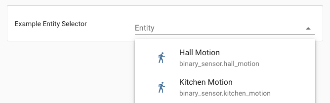
In its most basic form, this selector doesn’t require any options, which will show all entities.
entity:
Configuration Variables
When filter options are provided, the entities are limited by entities that at least match the given conditions. Can be either an object or a list of objects.
Can be set to an integration domain. Limits the list of entities to entities provided by the set integration domain, for example, zha.
Limits the list of entities to entities of a certain domain(s), for example, light or binary_sensor. Can be either a string with a single domain, or a list of string domains to limit the selection to.
Limits the list of entities to entities that have a certain device class(es), for example, motion or window. Can be either a string with a single device_class, or a list of string device_class to limit the selection to.
Allows selecting multiple entities. If set to true, the resulting value of this selector will be a list instead of a single string value.
The output of this selector is the entity ID, or (in case multiple is set to
true) a list of entity IDs.
# Example entity selector output result, when multiple is set to false
light.living_room

# Example entity selector output result, when multiple is set to true
- light.living_room
- light.kitchen
Example entity selector
An example entity selector that, will only show entities that are:
- Provided by the ZHA integration.
- From the Binary sensor domain.
- Have presented themselves as devices of a motion device class.
- Allows selecting one or more entities.
And this is what it looks like in YAML:
entity:
  multiple: true
  filter:
    - integration: zha
      domain: binary_sensor
      device_class: motion
Floor selector
The floor selector shows a floor finder that can pick
floors based on the selector configuration. The value of the input will be the
floor ID. If multiple is set to true, the value is a list of floor IDs.
A floor selector can filter the list of floors based on the properties of the devices and entities assigned to the areas on those floors. For example, the floor list could be limited to floors with entities provided by the ZHA integration, based on the areas they are in.
In its most basic form, this selector doesn’t require any options. It will show all floors.
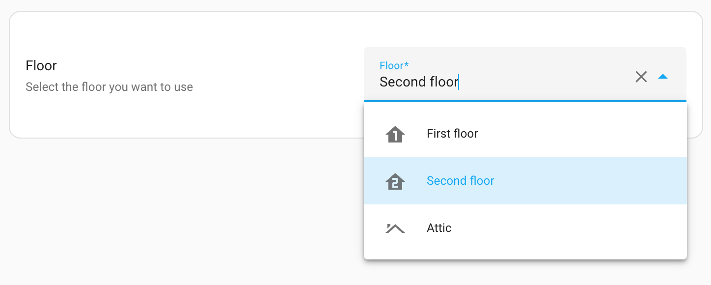
floor:
Configuration Variables
When device options are provided, the list of floors is filtered by floors that have at least one device matching the given conditions. Can be either an object or a list of objects.
Can be set to an integration domain. Limits the list of floors that have devices by this integration domain. For example, zha.
When set, the list only includes floors that have devices by the set manufacturer name.
When set, the list only includes floors that have devices which have the set model.
When entity options are provided, the list only includes floors that at least have one entity that matches the given conditions. Can be either an object or a list of objects.
Can be set to an integration domain. Limits the list of floors that have entities by the set integration domain. For example, zha.
When set, the list only includes floors that have entities of certain domains, for example, light or binary_sensor. Can be either a string with a single domain, or a list of string domains to limit the selection to.
When set, the list only includes floors that have entities with a certain device class, for example, motion or window. Can be either a string with a single device_class, or a list of string device_class to limit the selection.
The output of this selector is the floor ID, or (in case multiple is set to
true) a list of floor IDs.
# Example floor selector output result, when multiple is set to false
first_floor

# Example floor selector output result, when multiple is set to true
- first_floor
- second_floor
Example floor selectors
An example floor selector only shows floors that have one or more lights or switches provided by the ZHA integration.
floor:
  entity:
    integration: zha
    domain:
      - light
      - switch
Another example using the floor selector, which only shows floors that have one or more remote controls provided by the deCONZ integration. Multiple floors can be selected.
floor:
  multiple: true
  device:
    - integration: deconz
      manufacturer: IKEA of Sweden
      model: TRADFRI remote control
Icon selector
The icon selector shows an icon picker that allows you to select an icon.
icon:
The output of this selector is a string containing the selected icon,
for example: mdi:bell.
Label selector
The label selector shows a label finder that can pick labels. The value of the
input is the label ID. If multiple is set to true, the value is a list
of label IDs.
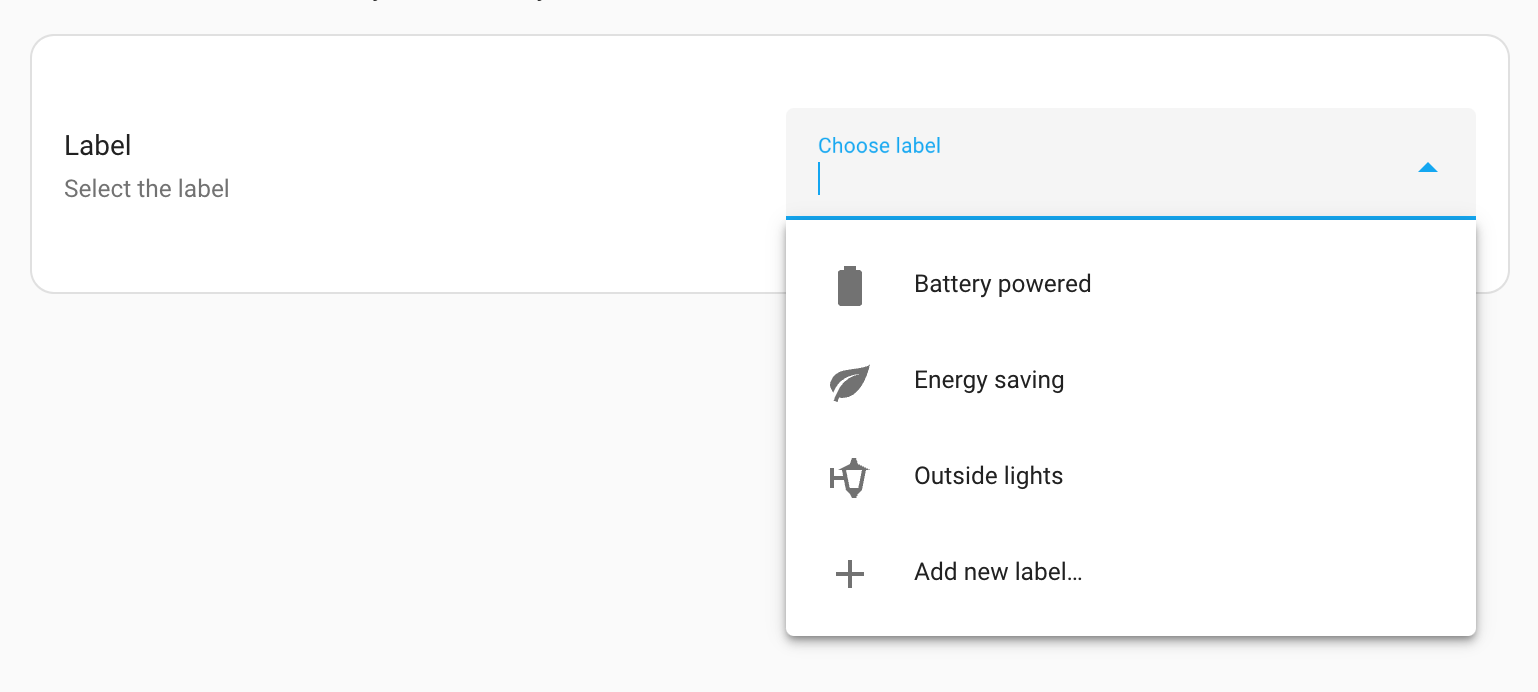
In its most basic form, this selector doesn’t require any options. It will show all labels.
label:
The output of this selector is the label ID, or (in case multiple is set to
true) a list of label IDs.
# Example label selector output result, when multiple is set to false
energy_saving

# Example label selector output result, when multiple is set to true
- energy_saving
- christmas_decorations
Language selector
The language selector allows a user to pick a language from a list of languages.
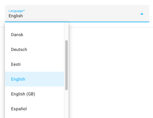
language:
Configuration Variables
A list of languages to pick from, this should be RFC 5646 languages codes.
The available languages in the Home Assistant frontend
Should the name of the languages be shown in the language of the user, or in the language itself.
The output of this selector is an RFC 5646 language code.
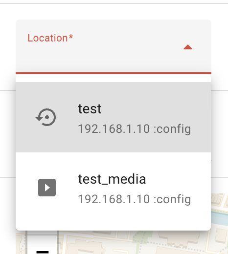
Location selector
The location selector allow a user to pick a location from a map and returns the matching longitude and latitude coordinators. Optionally it supports selecting the radius of the location.
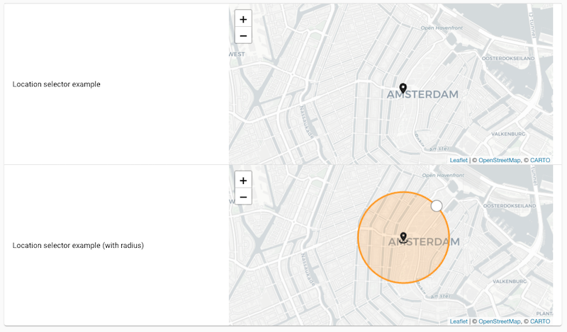
location:
The output of this selector is a mapping containing the latitude and longitude of the selected location, and, if enabled, the radius. For example:
latitude: 50.935
longitude: 6.95
radius: 500 # Only provided when radius was set to true.
Media selector
The media selector is a powerful selector that allows a user to easily select media to play on a media device. Media can be a lot of things, for example, cameras, local media, text-to-speech, Home Assistant Dashboards, and many more.
You are prompted to select the device used to play media. Once the device is selected, the media selector only shows media that is suitable for this device.
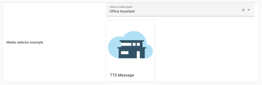
To ask the user to select a media device and suitable media, you can use the media selector without any options:
media:
You can also use the media selector with an optional accept filter to limit the
media types that can be selected. The user will not be asked to pick a device.
media:
  accept:
    - image/*
The output of the media selector is a mapping with information about the selected media device and the selected media to play. There is also metadata, which is used by the frontend and should not be used in the backend.
Example output:
entity_id: media_player.living_room
media_content_id: media-source://tts/cloud?message=TTS+Message&language=en-US&gender=female
media_content_type: provider
metadata:
  title: TTS Message
  thumbnail: https://brands.home-assistant.io/_/cloud/logo.png
  media_class: app
  children_media_class: null
  navigateIds:
    - {}
    - media_content_type: app
      media_content_id: media-source://tts
    - media_content_type: provider
      media_content_id: >-
        media-source://tts/cloud?message=TTS+Message&language=en-US&gender=female
Example output if accept filter is used. Note that the entity_id is not present:
media_content_id: media-source://tts/cloud?message=TTS+Message&language=en-US&gender=female
media_content_type: provider
metadata:
  title: TTS Message
  thumbnail: https://brands.home-assistant.io/_/cloud/logo.png
  media_class: app
  children_media_class: null
  navigateIds:
    - {}
    - media_content_type: app
      media_content_id: media-source://tts
    - media_content_type: provider
      media_content_id: >-
        media-source://tts/cloud?message=TTS+Message&language=en-US&gender=female
Example output when multiple is set to true (a list of media objects):
- media_content_id: media-source://media_source/local/image1.jpg
  media_content_type: image/jpeg
  metadata:
    title: image1.jpg
- media_content_id: media-source://media_source/local/image2.jpg
  media_content_type: image/jpeg
  metadata:
    title: image2.jpg
Number selector
The number selector shows either a number input or a slider input, that allows the user to specify a numeric value. The value of the input will contain the select value.
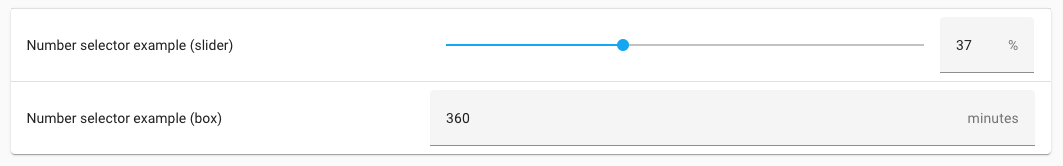
On the user interface, the input can either be in a slider or number mode. Both modes limit the user input by a minimum and maximum value, and can have a unit of measurement to go with it.
In its most basic form, this selector requires a minimum and maximum value:
number:
  min: 0
  max: 100
Configuration Variables
The step size of the number value. Set to "any" to allow any number.
Unit of measurement in which the number value is expressed in.
This can be either box or slider mode.
slider if min and max are set, otherwise box
Allows translations provided by an integration where translation_key is the translation key that is providing the unit_of_measurement string translation. See the documentation on Backend Localization for more information.
The output of this selector is a number, for example: 42
Example number selectors
An example number selector that allows a user a percentage, directly in a regular number input box.
number:
  min: 0
  max: 100
  unit_of_measurement: "%"
A more visual variant of this example could be achieved using a slider. This can be helpful for things like allowing the user to select a brightness level of lights. Additionally, this example changes the brightness in incremental steps of 10%.
number:
  min: 0
  max: 100
  step: 10
  unit_of_measurement: "%"
  mode: slider
Object selector
The object selector can be used to input arbitrary data in YAML form. This is useful for lists and dictionaries containing data for actions, for example. The value of the input will contain the provided data.
When used without options, the selector will accept any valid YAML content, such as objects, arrays, strings, or other YAML types. The input box is displayed as an editor with syntax highlighting.
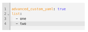
object:
When used with fields specified, the selector will force the object to be in this format by displaying a form.
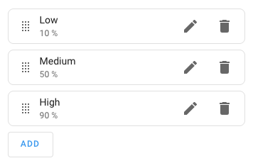
object:
  label_field: name
  description_field: percentage
  multiple: true
  fields:
    name:
      label: Name
      selector:
        text:
    percentage:
      label: Percentage
      selector:
        number:
          unit_of_measurement: "%"
The output of this selector is a YAML object.
Configuration Variables
List of fields of the object.
The field to use as a label. By default, it will be the first field defined. This option is only used if fields option set.
The field to use as a description. This option is only used if fields option set.
Allows translations provided by an integration where translation_key is the translation key that is providing the selector option strings translation. See the documentation on Backend Localization for more information.
QR code selector
The QR code selector shows a QR code. It has no return value.

The QR code’s data must be configured, and optionally, the scale, and error correction level can be set. The scale makes the QR code bigger or smaller.
qr_code:
  data: "https://home-assistant.io"
  scale: 5
  error_correction_level: quartile
RGB color selector
The RGB color selector allows you to select a color from a color picker from the user interface, and returns the RGB color value.
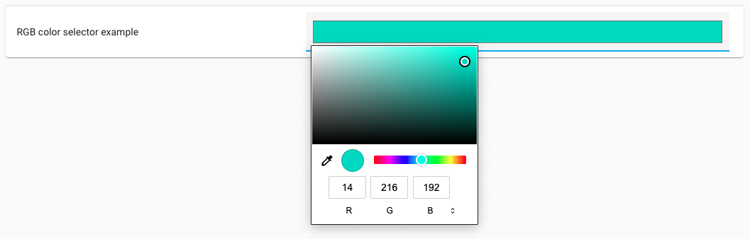
color_rgb:
This selector does not have any other options; therefore, it only has its key.
The output of this selector is a list with the three (RGB) color value, for example: [255, 0, 0].
Select selector
The select selector shows a list of available options from which the user can choose. The value of the input contains the value of the selected option. Only a single option can be selected at a time.
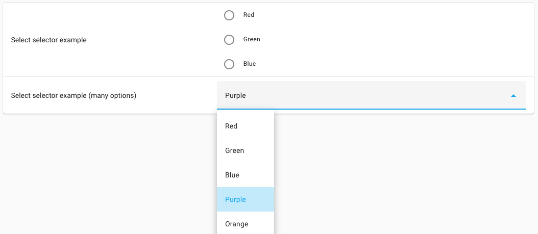
The selector requires a list of options that the user can choose from.
select:
  options:
    - Red
    - Green
    - Blue
Configuration Variables
List of options that the user can choose from. Small lists (5 items or less), are displayed as radio buttons. When more items are added, a dropdown list is used.
Allows selecting multiple options. If set to true, the resulting value of this selector will be a list instead of a single string value.
Allows the user to enter and select a custom value (or multiple custom values in addition to the listed options if multiple is set to true).
This can be either list (radio buttons) or dropdown (combobox) mode. When not specified, small lists (5 items or less), are displayed as radio buttons. When more items are added, a dropdown list is used. If custom_value is true, this setting will be ignored and the frontend will use a dropdown input.
Allows translations provided by an integration where translation_key is the translation key that is providing the selector option strings translation. See the documentation on Backend Localization for more information.
Alternatively, a mapping can be used for the options. When you want to return a different value compared to how it is displayed to the user.
select:
  options:
    - label: Red
      value: r
    - label: Green
      value: g
    - label: Blue
      value: b
Configuration Variables
List of options that the user can choose from. Small lists (5 items or less), are displayed as radio buttons. When more items are added, a dropdown list is used.
When multiple is false, the output of this selector is the string of
the selected option value. When selecting Green in the last example,
it returns: g, in the first example it would return Green.
When multiple is true, the output of this selector is the list of selected
option values. In this case, if Green was selected, in the first example it
would return [“Green”] and in the last example it returns [“g”].
State selector
The state selector shows a list of states for a provided entity of which one or more can be selected.
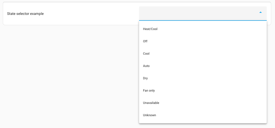
The output of this selector is the select state (not the translated or
prettified name shown in the frontend), or a list of states if multiple is true.
For example: heat_cool.
Statistic selector
The statistic selector selects the statistic ID of an entity that records
Long-term statisticsHome Assistant saves long-term statistics for a sensor if the entity has a state_class of measurement, total, or total_increasing. For short-term statistics, a snapshot is taken every 5 minutes. For long-term statistics, an hourly aggregate is stored of the short-term statistics. Short-term statistics are automatically purged after a predefined period (default is 10 days). Long-term statistics are never purged. [Learn more]. It may resemble an entity ID (like sensor.temperature),
or an external statistic ID (like external:temperature).
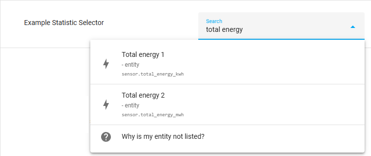
The output of this selector is a string representing a statistic ID, or
a list of statistic IDs if multiple is set to true.
Target selector
The target selector is a rather special selector, allowing the user to select targeted entities, devices, or areas for actions. The value of the input will contain a special target format, that is accepted by actions.
The selectable targets can be filtered, based on entity or device properties. Areas are only selectable as a target, if some entities or devices match those properties in those areas.

In its most basic form, this selector does not require any options, which will allow the user to target any entity, device or area available in the system.
target:
Configuration Variables
When entity options are provided, the targets are limited by entities that at least match the given conditions. Can be either an object or a list of objects.
Can be set to an integration domain. Limits targets to entities provided by the set integration domain, for example, zha.
Limits the targets to entities of a certain domain(s), for example, light or binary_sensor. Can be either a with a single domain, or a list of string domains to limit the selection to.
Limits the targets to entities with a certain device class(es), for example, motion or window. Can be either a string with a single device_class, or a list of string device_class to limit the selection to.
Limits the targets to entities with a certain supported feature, for example, light.LightEntityFeature.TRANSITION or climate.ClimateEntityFeature.TARGET_TEMPERATURE. Should be a list of features. For a list of supported features for each entity type, refer to the entity documentation.
Targets are meant to be used with the target property of an action in
a script sequence. For example:
actions:
  - action: light.turn_on
    target: !input lights
Example target selectors
An example target selector that only shows targets that at least provide one or more lights, provided by the ZHA integration.
target:
  entity:
    - integration: zha
      domain: light
Template selector
The template selector can be used to input a Jinja2 template. This is useful for allowing more advanced user-input that use Jinja2 templates.
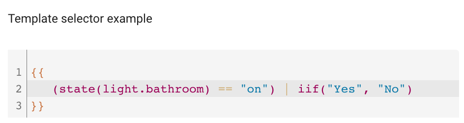
This selector does not have any other options; therefore, it only has its key.
template:
The output of this selector is a template string.
Text selector
The text selector can be used to enter a text string. It can also be used to enter a list of text strings; if multiple is set to true. The value of the input will contain the selected text. This can be used in shopping lists, for example.
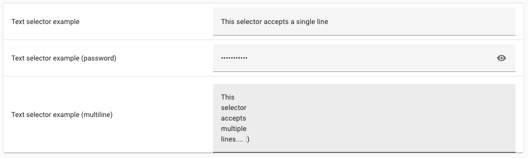
Unless multiline is set to true, this selector behaves exactly like if no selector at all was specified, and will display a single line text input box on the user interface.
text:
Configuration Variables
Set to true to display the input as a multi-line text box on the user interface.
The type of input. This supplies the HTML type attribute, which controls how the browser displays and validates the field. A subset of types available to the attribute are supported, since some are handled by other selectors. Possible types are: color, date, datetime-local, email, month, number, password, search, tel, text, time, url, week.
Guides the browser on the type of information which should automatically fill the field. This supplies the HTML autocomplete attribute. Any value supported by the HTML attribute is valid.
The output of this selector is a single string value.
Theme selector
The theme selector allows for selecting a theme from the available themes installed in Home Assistant.
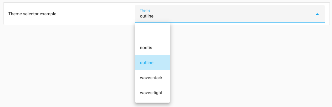
theme:
The output of this selector will contain the selected theme, for example:
waves_dark.
Time selector
The time selector shows a time input that allows you to specify a time of the day.

This selector does not have any other options; therefore, it only has its key.
time:
The output of this selector will contain the time in 24-hour format,
for example, 23:59:59.
Trigger selector
The triggers selector allows you to input one or more triggers. On the user interface, the trigger part of the automation editor is shown. The value of the input contains a list of triggers.
This selector does not have any other options; therefore, it only has its key.
trigger:
The output of this selector is a list of triggers. For example:
# Example trigger selector output result
- trigger: numeric_state
  entity_id: "sensor.outside_temperature"
  below: 20
Example - Merging with existing triggers
If the trigger(s) should exist within a blueprint that already has some default triggers defined, and an additional customizable trigger should be merged, you need to use the - triggers syntax in the blueprint.
# Example trigger selector
input:
  my_trigger_input:
    selector:
      trigger:
triggers:
  - triggers: !input my_trigger_input
  - platform: numeric_state
  [...]