Home Assistant frontend
The Frontend integrationIntegrations connect and integrate Home Assistant with your devices, services, and more. [Learn more] provides the official frontend to control Home Assistant. It is enabled by default unless you’ve disabled or removed the default_config: line from your configuration.yamlThe configuration.yaml file is the main configuration file for Home Assistant. It lists the integrations to be loaded and their specific configurations. In some cases, the configuration needs to be edited manually directly in the configuration.yaml file. Most integrations can be configured in the UI. [Learn more] file. If that is the case, enable it manually by adding the following to your configuration:
# Example configuration.yaml entry
frontend:
Configuration Variables
Allows you to define different themes. See Defining themes for details.
List of additional JavaScript modules to load in latest JavaScript mode.
Allows you to point to a directory containing frontend files instead of taking them from a prebuilt PyPI package. Useful for Frontend development. For more information, see Frontend development.
Allows you to point to a specific frontend pull request containing frontend files instead of taking them from a prebuilt PyPI package. Useful for Frontend development. This requires github_token to be set. For more information, see Frontend development.
GitHub token to use when fetching frontend files from a specific pull request. Required when development_pr is set. For more information, see Creating a GitHub token.
Defining themes
Theme format
The frontend integration allows you to create custom themes to influence the look and feel of the user interface.
Example of a configuration entry in the configuration.yamlThe configuration.yaml file is the main configuration file for Home Assistant. It lists the integrations to be loaded and their specific configurations. In some cases, the configuration needs to be edited manually directly in the configuration.yaml file. Most integrations can be configured in the UI. [Learn more] file:
# Example configuration.yaml entry
frontend:
  themes:
    happy:
      primary-color: pink
      accent-color: orange
    sad:
      primary-color: steelblue
      accent-color: darkred
The example above defines two themes named happy and sad. For each theme, you can set values for CSS variables. If you want to provide hex color values, wrap those in quotation marks, since otherwise, YAML would consider them a comment (primary-color: "#123456").
Supported theme variables
Primary and accent color
Primary and accent colors are the main colors of the application.
They can be modified using the primary-color and accent-color variables.
State color
Each entity has its own color, based on domain, device_class, and state, so it is easily recognizable. These colors are used in dashboards and history. Home Assistant has default color rules that fit most use cases.
Here is a list of domains that support colors: alarm_control_panel, alert, automation, binary_sensor, calendar, camera, climate, cover, device_tracker, fan, group, humidifier, input_boolean, light, lock, media_player, person, plant, remote, schedule, script, siren, sun, switch, timer, update, and vacuum.
The color rules can be customized using theme variables:
state-{domain}-{device_class}-{state}-colorstate-{domain}-{state}-colorstate-{domain}-(active|inactive)-colorstate-(active|inactive)-color
The variables are evaluated in the listed order, so if multiple variables match your entity, the first match (the most specific one) is used.
# Example configuration.yaml entry
frontend:
  themes:
    my_theme:
      state-cover-garage-open-color: "#ff0000"
      state-media_player-inactive-color: "#795548"
The example above defines red color for open garage doors and brown color for inactive media players.
Unsupported theme variables
Although we do our best to keep things working, the behavior of other theme variables can change between releases. For a partial list of variables used by the main frontend see color.globals.ts.
Dark mode support
You can also create themes that are based on the default dark mode theme. New themes can also support both light and dark mode and let you switch between them on the user profile page:

Here’s an extended example showing the mode definitions:
# Example configuration.yaml entry
frontend:
  themes:
    happy:
      primary-color: pink
      text-primary-color: purple
    sad:
      primary-color: steelblue
      modes:
        dark:
          secondary-text-color: slategray
    day_and_night:
      primary-color: coral
      modes:
        light:
          secondary-text-color: olive
        dark:
          secondary-text-color: slategray
Theme happy: Same as in the previous example. This legacy format is still supported and automatically uses the default light theme as the base.
Theme sad: By using the new modes key plus the subkey dark this theme will now be based on the default dark theme. The final theme rules are determined in three steps: First, the default dark theme CSS variables will be applied, then second the CSS variables from the top level of the theme that are mode-independent (primary-color: steelblue in this example) and lastly the mode-specific CSS variables will be layered on top (secondary-text-color: slategray).
Note: Since this example theme only has a dark mode defined, this mode will automatically be used.
Theme day_and_night: This theme has both a light and a dark mode section. That tells the frontend to allow the user to choose which mode to use from the user profile (default selection is based on the system settings). Independent of the selection, the primary color will be set to coral, but based on the chosen mode either the default light or dark theme will be used as the basis for rendering, plus the secondary text color will be either olive or slategray.
Theme configuration splitting
As with all configuration, you can either:
- Directly specify the themes inside your
configuration.yamlThe configuration.yaml file is the main configuration file for Home Assistant. It lists the integrations to be loaded and their specific configurations. In some cases, the configuration needs to be edited manually directly in the configuration.yaml file. Most integrations can be configured in the UI. [Learn more] file. - Put them into a separate file (for example,
themes.yaml) and include that in your configuration (themes: !include themes.yaml). - Create a dedicated folder (for example,
my_themes) and include all files from within this folder (themes: !include_dir_merge_named my_themes).
For more details, see Splitting up the configuration.
Check our community forums to find themes to use.
Applying themes
When themes are enabled in your configuration.yamlThe configuration.yaml file is the main configuration file for Home Assistant. It lists the integrations to be loaded and their specific configurations. In some cases, the configuration needs to be edited manually directly in the configuration.yaml file. Most integrations can be configured in the UI. [Learn more] file, you can apply them in two ways.
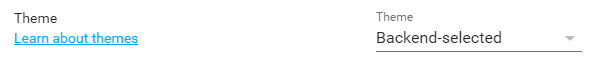
The first is per user. A theme selector appears on the user profile page, which you can access by selecting your user account initials at the bottom of the sidebar. Choose any installed theme from the dropdown list, and it is applied immediately. This choice is saved to your user profile, so it applies across your devices. It also overrides any theme set through the actions below.
 Set a theme
The second is system-wide, using actions. The Set theme action sets the default light and dark theme for everyone, for example to switch automatically between a lighter look during the day and a darker one at night. The Reload themes action reloads your theme definitions after you edit them in YAML.
List of actions
The Home Assistant frontend integrationIntegrations connect and integrate Home Assistant with your devices, services, and more. [Learn more] provides the following actions. Each link below opens a dedicated page with examples, parameters, and a step-by-step UI walkthrough.
-
Reload themes (
frontend.reload_themes) Reloads the theme configuration from your configuration.yaml file. -
Set theme (
frontend.set_theme) Sets the theme Home Assistant uses by default.
For an overview of every action across all integrations, see the actions reference.
Loading extra JavaScript
You can load extra custom JavaScript.
Example:
# Example configuration.yaml entry
frontend:
  extra_module_url:
    - /local/my_module.js
  extra_js_url_es5:
    - /local/my_es5.js
Modules will be loaded with import('{{ extra_module_url }}'), on devices that support it (latest mode).
For other devices (es5 mode) you can use extra_js_url_es5, this will be loaded with <script defer src='{{ extra_js_url_es5 }}'></script>.
The ES5 and module versions are never both loaded. Depending on whether the device supports import, either the module or the ES5 version is loaded.
Manual language selection
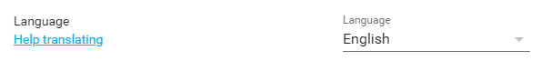
The browser language is automatically detected. To use a different language, go to the user profile page (which you can access by selecting your user account initials at the bottom of the sidebar) and select one. It is applied immediately.
 Choose a language